Medleyy Posted March 23, 2012 Share Posted March 23, 2012 @Andiii:> @Aeri,> It's a long sword/spear lolI got that…It's just that you can't see the handle, thus it looks like he's holding it in one hand sticking out sideways. The handle needs adjusting, colour-wise. Link to comment Share on other sites More sharing options...
ToshiroHayate Posted March 23, 2012 Share Posted March 23, 2012 @Aeri:> I got that…> > It's just that you can't see the handle, thus it looks like he's holding it in one hand sticking out sideways. The handle needs adjusting, colour-wise.The polearm is probably colored that way to match the armor-set.Also, glad to see you're still working on this, Andiii! How far along are you now? Link to comment Share on other sites More sharing options...
deathtaker26 Posted March 23, 2012 Share Posted March 23, 2012 These are truly amazing :D I like your work:star: :star: :star: :star: :star: Link to comment Share on other sites More sharing options...
Andiii Posted March 23, 2012 Author Share Posted March 23, 2012 @Aeri,The handle is black throughout all 3 attack frames. I broke my style of black outlines outside but never inside, so that the handle pops outward. I'll post the individual frames later.@Toshiro Hayate,Yep, you're correct :) Color of the handle is black.I'm not that far lol. I have the 12 basic walking sprites, but haven't done the attack animations for the others except the front.Tiles are going okay. I have basic ones, but not much decorations.@Crest,Thanks! Much appreciated. That's 5/5 right? xD Link to comment Share on other sites More sharing options...
Jeff Posted March 25, 2012 Share Posted March 25, 2012 @Andiii:> programmers! I joined a team, but nothing yet. I gotta give to get :) Pixeling art for programming codes haha.I'm late but… Fuck Yeah Devox! I'm sure John'll crank out any features you need when he gets his laptop back. He codes Eclipse Features fairly quickly.The assassin looks awesome, but do you think the swords are a bit dull? It could just be me... Link to comment Share on other sites More sharing options...
Andiii Posted March 25, 2012 Author Share Posted March 25, 2012 @Eckhart:> I'm late but… duck Yeah Devox! I'm sure John'll crank out any features you need when he gets his laptop back. He codes Eclipse Features fairly quickly.> > The assassin looks awesome, but do you think the swords are a bit dull? It could just be me...Of course they're dull lol. They're just iron. Not high quality like steel or dragon. Don't worry, 400x means lots of space to add details. Link to comment Share on other sites More sharing options...
slym Posted March 25, 2012 Share Posted March 25, 2012 Drop those outlines. Before applying an outline to anything you have to consider what the purpose of the outline is. Ask yourself if the object needs to be separated from the environment. In most cases you'll find that the only objects that need to be separated are sprites and the tops of buildings or other tall objects. I also disagree with attempting the style you are going for right now. Whenever you do a minimalist or simple style you have to make up for the lack of detail by perfecting your shapes.Right now there is absolutely no sense of depth in your tiles. While shadows may be time consuming to map out, they are one of the quickest ways to help the lack of detail you already have with this style. Darken your shadows. Another thing is that all of your tiles have no texture. When making grass think of the blades of grass rather than making it a foamy green surface. I do notice that you attempted this in your new versions, but you should consider defining this texture even more than it is now. In most cases you can also exaggerate the size of such textures, which should make it much easier to keep the simple style that you are going for.Making water with opacity is incredibly lazy. If you want to be a pixel artist, use the tools of the trade. Think about what makes pixel art the clearest form of graphic art.As far as colors go, you are completely lacking contrast. And by contrast I'm referring to contrast in both ramps and the palette in general. You are missing many parts of the color spectrum, which is why the mockups look so dull.I do like that you've gone after perspective with these tiles. Make sure that you create your sprites in the same perspective, and they are also lacking contrast. I haven't checked if you did, but use a separate palette for your sprite than your tiles to get them to stand out more.Anyway, I hope that helps and wish you luck on your project. Link to comment Share on other sites More sharing options...
zade_o Posted April 10, 2012 Share Posted April 10, 2012 Quick suggestion on the stairs, not sure if anyone's posted one but I don't feel like reading through the 7 pages.try something like this:I didn't repixel anything, just stretched the stairs down a bit so they come off of the cliff but still have that perspective. Link to comment Share on other sites More sharing options...
Octohunter Posted April 11, 2012 Share Posted April 11, 2012 I love your style. I'm envious of your skill :) Link to comment Share on other sites More sharing options...
Andiii Posted October 10, 2013 Author Share Posted October 10, 2013 10.10.13BOO! It's been a while :) Been doing lots the past year, nothing really productive though. I started streaming on Twitch and have been trying to build my stream (427 followers :D) via streaming StarCraft 2, Hearthstone, weekly Friday giveaways. Even painted and pixeled SC2 art! More at [http://revangale.deviantart.com/gallery/45411452](http://revangale.deviantart.com/gallery/45411452)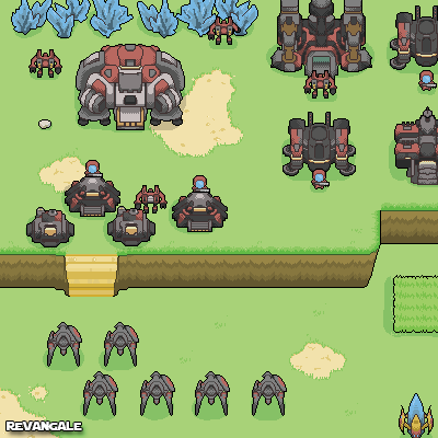So, anyways, finally got some motivation to do something with these graphics! I never really tested the graphics out. They were all mockups, so I spent the daytransferring 90% of what I had. After today, new graphics on the way! http://www.youtube.com/watch?v=LtR_QVUBkj8http://www.youtube.com/watch?v=hJEILiQuKBI Link to comment Share on other sites More sharing options...
James Posted October 10, 2013 Share Posted October 10, 2013 So are you going to go ahead with making the game now or just test the graphics? It would be a shame to waste them Link to comment Share on other sites More sharing options...
Andiii Posted October 10, 2013 Author Share Posted October 10, 2013 > So are you going to go ahead with making the game now or just test the graphics? It would be a shame to waste themMake the game. Once I think there's enough gfx, I'm gonna find a programmer. Link to comment Share on other sites More sharing options...
James Posted October 10, 2013 Share Posted October 10, 2013 Glad to here it we need more games like this :) Link to comment Share on other sites More sharing options...
Andiii Posted October 13, 2013 Author Share Posted October 13, 2013 Hey! Finally got some decent looking logos out. I'd be grateful if you guys can tell me your favorite and critique them too! Constructive please :)#1 and #5 are my favorite btw. Link to comment Share on other sites More sharing options...
Domino_ Posted October 13, 2013 Share Posted October 13, 2013 They look good, maybe make logo animated like it flashes and changes that character position? :) Link to comment Share on other sites More sharing options...
Andiii Posted October 13, 2013 Author Share Posted October 13, 2013 Great idea, I'll try to animate her. I think 5th version is easier to do so. Link to comment Share on other sites More sharing options...
Domino_ Posted October 13, 2013 Share Posted October 13, 2013 Want to know one cool fact?Type in any online translater ur project name "Zelts" and make him to transtale from Latvian to English language and thats how we can call your project. :) Link to comment Share on other sites More sharing options...
Andiii Posted October 13, 2013 Author Share Posted October 13, 2013 I just did on Google translator. It means gold lol. Link to comment Share on other sites More sharing options...
James Posted October 13, 2013 Share Posted October 13, 2013 I like the last one but I think the figure would look better in black like a silouhette Link to comment Share on other sites More sharing options...
Andiii Posted October 13, 2013 Author Share Posted October 13, 2013 > I like the last one but I think the figure would look better in black like a silouhetteK I'll make a few with the black silhouette for the character. Link to comment Share on other sites More sharing options...
Zopto Posted October 13, 2013 Share Posted October 13, 2013 very very super nice!–---------------------------------------------------------now i see i need to practice more my pixel art skills Link to comment Share on other sites More sharing options...
Andiii Posted October 13, 2013 Author Share Posted October 13, 2013 > very very super nice!> > –---------------------------------------------------------> > now i see i need to practice more my pixel art skillsThanks! Link to comment Share on other sites More sharing options...
gdog12356 Posted October 17, 2013 Share Posted October 17, 2013 Looks cool. Link to comment Share on other sites More sharing options...
Fabzy Posted October 22, 2013 Share Posted October 22, 2013 i like the style of this, deffenatly one to follow Link to comment Share on other sites More sharing options...
lel Posted October 23, 2013 Share Posted October 23, 2013 What is this made with. Your project looks really good. But I honestly don't know much about it. Link to comment Share on other sites More sharing options...

Recommended Posts
Create an account or sign in to comment
You need to be a member in order to leave a comment
Create an account
Sign up for a new account in our community. It's easy!
Register a new accountSign in
Already have an account? Sign in here.
Sign In Now