DovahTech Posted May 29, 2013 Author Share Posted May 29, 2013 I don't think showing off is the correct term for it. I've recently gotten back into Mapping, I threw together a map with two intentions:1\. To get comfortable with Eclipse and the controls2\. To experiment with a tileset I'm not familiar withIt was intentionally small, I didn't want to dive head first into mapping again. It's simplicity is explained by in a way 'Not going out of my comfort zone'. Quite simply, last time I posted a map on Eclipse it really helped me out. To hear both negative and positive criticism helped me get a better sense of what I was trying to accomplish. Although the path itself is pretty rough, mostly because I've always found paths hard to do; I would like to hear about what I could improve on this map, I love to hear peoples opinions from a different perspective, and it's a great feeling knowing that you're actually improving one of your skills. Thanks for taking the time to read this ol' chunk of writing. Please comment openly, I am sure not to take offence.'A simple forest path'[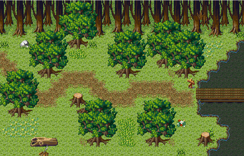](http://s1275.photobucket.com/user/Parrington_Adam/media/MapTesting1_zpsfd7471b7.png.html)With players:[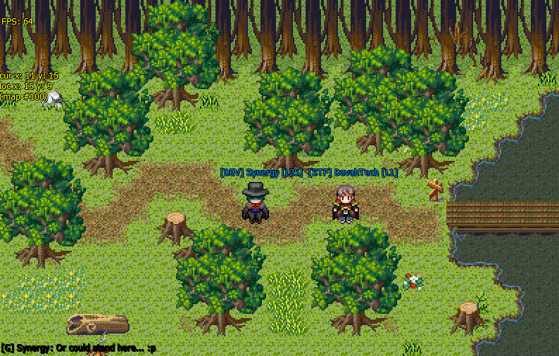](http://s1275.photobucket.com/user/Parrington_Adam/media/Screeny_zps49c3c142.png.html)Note: This map was done for a member of the community to give them an idea of my current mapping capabilities. With the obvious judging deductions of the points I made. I don't want to hear that it's too simple or small. I know this. Link to comment Share on other sites More sharing options...
Zeno Posted May 29, 2013 Share Posted May 29, 2013 It's pretty good.Seems too linear for a forest IMO. The trees at the top are a horizontal line. The path is a horizontal line. The top clump of trees are basically a horizontal line. It's very parallel. Forests tend to be quite jagged and random. If you placed entire trees with your eyes closed or your back turned, it would probably look more like one. Link to comment Share on other sites More sharing options...
Synergy Posted May 29, 2013 Share Posted May 29, 2013 Some more variation in the grass would be nice.  Link to comment Share on other sites More sharing options...
DovahTech Posted May 29, 2013 Author Share Posted May 29, 2013 So in general a bit more variation and less linear placement? Thanks guys :3 Link to comment Share on other sites More sharing options...
Daneta Posted May 29, 2013 Share Posted May 29, 2013  …..............................WHY WONT YOU LET ME HIRE YOU. I am crying on the inside  Link to comment Share on other sites More sharing options...
Synergy Posted May 29, 2013 Share Posted May 29, 2013 >  …..............................WHY WONT YOU LET ME HIRE YOU. I am crying on the inside Oh shush. I already explained that. Link to comment Share on other sites More sharing options...
juvanio Posted May 29, 2013 Share Posted May 29, 2013 I want to see where the bridge leads to D:It's amazing, I just love how it gives me the "You're in the forest, now feel like slenderman is following you." kind of feeling. And, is that a sign near the bridge? I'm blind D: Link to comment Share on other sites More sharing options...
DMF Posted May 30, 2013 Share Posted May 30, 2013 looks ok but really depends, does it fit in sizes with your characters? thats a big factor. Link to comment Share on other sites More sharing options...
Zeno Posted May 30, 2013 Share Posted May 30, 2013 ^I think we can safely assume 32x32 or 32x64.I was thinking - in art it's sometimes recommended to focus on the edges. You can use less visual space to present more visual information. Like, if you place a couple tree tops on the bottom, or some branches and half a log on the left, you get a lot more visual impact with a lot less work. That said, when you're mapping a game you have to make sure the tiles line up between maps, which is often a lot more work in the end, but IMO it's worth it. Looks more natural and less centred on the middle, and a surefire way to add fluidity to an area! Link to comment Share on other sites More sharing options...
TheRexion Posted May 30, 2013 Share Posted May 30, 2013 Not bad not bad. Could use a bit more… life, with the tile choice and placement, but it is otherwise nice. Link to comment Share on other sites More sharing options...
azkanan Posted May 30, 2013 Share Posted May 30, 2013 Elevation, Elevation, Elevation! Every show-off thread of mapping is, most often, missing this! Elevation is what brings a world to life, I've never been anywhere in the wild in my entire life where it's totally flat within a 10 meter radius! Link to comment Share on other sites More sharing options...
TorenRenne Posted May 30, 2013 Share Posted May 30, 2013 To be honest, thats a pretty sweet map. The only 2 flaws have been addressed previously.The top "edge" needs more variation and looks too linear.You can add tree-tops along the bottom to make it seem like the map goes on further south. Also possibly pop half a tree on the left. Although it depends on the style.If thats the EDGE of the forest and to the south is an opening field then thats fine. Link to comment Share on other sites More sharing options...
DovahTech Posted May 30, 2013 Author Share Posted May 30, 2013 First off I'd like to thank everyone for their comments, as I've said before it really helps.@Ahri Thank you :3 Yes that is a sign.@Azkanan I attempted some elevation down the bottom of the map, as Viper said to give the impact of the edge of a forest. I understand what you mean and will try to do so in the future ^^.@Ark King I also understand what you mean, the next map I do will be larger. I found that with the flowers ect it was hard to do big patches as they ended up dominating the map. It will be easier to add 'life' on a bigger scale. Thanks@Zeno I never thought of it like that before, it allows the possibility for the player to imagine the map is a lot more complicated than it is. Virtually as you stated. Thanks!@Viper Thank you for your kind comments ^^ I should have put more thought into the placement of the area in relative to everything else.Photo for DarkMatchFlame displaying sprite size:[](http://s1275.photobucket.com/user/Parrington_Adam/media/Screeny_zps49c3c142.png.html) Link to comment Share on other sites More sharing options...
DMF Posted May 30, 2013 Share Posted May 30, 2013 try to added darkness type depth behind the tree at top, the normal tres should have different hights to show a sense of being alive, flowers and grass covers look ok, keep improving  Link to comment Share on other sites More sharing options...
Synergy Posted May 30, 2013 Share Posted May 30, 2013 > Elevation, Elevation, Elevation! Every show-off thread of mapping is, most often, missing this! Elevation is what brings a world to life, **I've never been anywhere in the wild in my entire life where it's totally flat within a 10 meter radius!**[http://en.wikipedia.org/wiki/Norfolk](http://en.wikipedia.org/wiki/Norfolk) Link to comment Share on other sites More sharing options...
Nook Posted May 30, 2013 Share Posted May 30, 2013 Looks like you're emulating an emulation of an emulation of the real world. It's tiring to see tree stumps, logs, and patches of tall grass scattered in the most random of places. Impracticality =/= variety. When you're desperate for filler, it shows.As for the useful criticism given already: concentrate especially on edges and transitions. Don't make your maps look like neatly closed systems. Make 'em organic. You want it to feel like the player is exploring a landscape, not navigating a hallway made out of grass.I get that a lot of my complaints are pretty typical for retro tiles, but it doesn't have to be that way. Link to comment Share on other sites More sharing options...
Vortigem Posted June 1, 2013 Share Posted June 1, 2013 > Elevation, Elevation, Elevation! Every show-off thread of mapping is, most often, missing this! Elevation is what brings a world to life, I've never been anywhere in the wild in my entire life where it's totally flat within a 10 meter radius!Kansas.@OP looks real nice thus far. One of the things I might do is touch up some custom tiles, so that the trees in the open share the same shadow at the ground that the backdrop trees have. That will help the trees and grass tiles meet smoother. Link to comment Share on other sites More sharing options...
DovahTech Posted June 1, 2013 Author Share Posted June 1, 2013 @Nook> not navigating a hallway made out of grass.That is one of those sentences that open my eyes. Thank you. Link to comment Share on other sites More sharing options...

Recommended Posts
Create an account or sign in to comment
You need to be a member in order to leave a comment
Create an account
Sign up for a new account in our community. It's easy!
Register a new accountSign in
Already have an account? Sign in here.
Sign In Now