Lukin Posted April 3, 2010 Author Share Posted April 3, 2010 So.. Everything here is made by me, except the actual Eclipse thing of course, and the Player sprite.Comment on what I could improve and what you like about it etc. :)I will be updating this topic as I progress with my tileset.Don't mind the crappy grass, trying to remake a more simpler tile but still make it realistic, not sure how, someone suggest a tutorial or help me! :O**Do not even think about stealing these things, I made them, therefore I got the copyright of them, if I see them used somewhere, you're doomed. :)**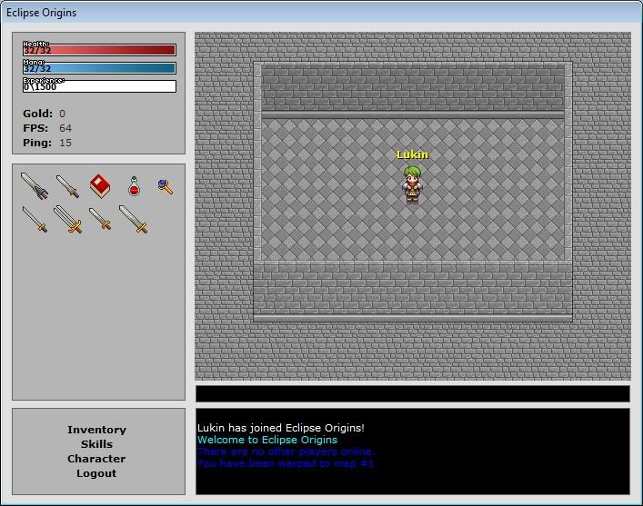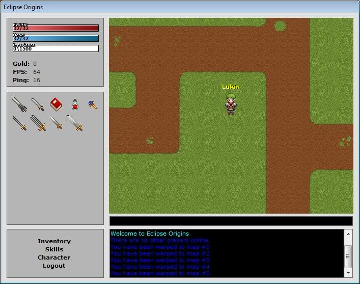(This is not an attempt to make an awesome map, it is just to show what I've done, graphic wise. xD) Link to comment Share on other sites More sharing options...
Nahchito Posted April 3, 2010 Share Posted April 3, 2010 Those look awesome! its a great tileset man.i suppose yuo also made those items, right? Link to comment Share on other sites More sharing options...
Lukin Posted April 3, 2010 Author Share Posted April 3, 2010 Yes I did. :P Still trying to figure out axes though. Link to comment Share on other sites More sharing options...
magezhilo Posted April 3, 2010 Share Posted April 3, 2010 I'm pretty certain I've seen that log before… :huh: Link to comment Share on other sites More sharing options...
Lukin Posted April 3, 2010 Author Share Posted April 3, 2010 @Wraith:> I'm pretty certain I've seen that log before… :huh:Yeah, you most likely have, since I followed a tutorial and I made the log pretty much the same angle and that twig sticking up. Link to comment Share on other sites More sharing options...
magezhilo Posted April 3, 2010 Share Posted April 3, 2010 that's the one. There was a big argument about someone who followed that tutorial a long while back. Anyway rest of the tiles look alright, but some of them clash with eachother. Link to comment Share on other sites More sharing options...
ddunit Posted April 3, 2010 Share Posted April 3, 2010 Lool, someone made that log using a tutorial ages ago and was flamed for it. Link to comment Share on other sites More sharing options...
Lukin Posted April 3, 2010 Author Share Posted April 3, 2010 @Ddunit:> Lool, someone made that log using a tutorial ages ago and was flamed for it.Oh well, if someone cares enough to find the tutorial again, you will see that the shading, outlines, and details doesnt match at all. Link to comment Share on other sites More sharing options...
Lukin Posted April 3, 2010 Author Share Posted April 3, 2010 @Wraith:> that's the one. There was a big argument about someone who followed that tutorial a long while back. Anyway rest of the tiles look alright, but some of them clash with eachother.They are not supposed to be used like this, I will row them up into tilesets where they belong later, just right now I need to make some graphics and there's not much I can put into a single screen on Eclipse, so I just use them all at once. xD Link to comment Share on other sites More sharing options...
IceCream Tuesday Posted April 3, 2010 Share Posted April 3, 2010 trees are sooo small! Link to comment Share on other sites More sharing options...
Myron Posted April 3, 2010 Share Posted April 3, 2010 Maybe they are growing trees? ;) Link to comment Share on other sites More sharing options...
Microwave Posted April 3, 2010 Share Posted April 3, 2010 yea the trees in relation to the log have a proportions issue. the black/white tile seems to large and might be displeasing in use. I like your orange rock/sand(?). The fountain could use some kind of texturing. Link to comment Share on other sites More sharing options...
Lukin Posted April 3, 2010 Author Share Posted April 3, 2010 @IceCream:> trees are sooo small!Its a bush like.. thingy.. :OHaven't learned how to make big trees yet lol.. :(@Microwave:> yea the trees in relation to the log have a proportions issue. the black/white tile seems to large and might be displeasing in use. I like your orange rock/sand(?). The fountain could use some kind of texturing.Yeah, the fountain isn't done, the black and white tiles are mostly supposed to be inside, and to play chess on. Link to comment Share on other sites More sharing options...
Lukin Posted April 4, 2010 Author Share Posted April 4, 2010 Oh and yeah, the game I am going to make wont be using 32x32 sprites, it will be using 32x64 ones, so that's why most of the tiles are big while the screenshot shows a tiny little guy. xD Link to comment Share on other sites More sharing options...
balliztik1 Posted April 4, 2010 Share Posted April 4, 2010 Tiles look pretty good, but the map doesn't do it justice. I realize it's probably just a quick showoff for the tiles, so it shouldn't be an issue later, but things just look so out of element. My only real problem is the building. I think some shadow or something would help it appear less flat. As it is, it just kind of blends into the scenery, which shouldn't happen.Very nice start, however. You'll need to keep going with the whole style like this, though. If you can, it'll be pretty nice. Link to comment Share on other sites More sharing options...
Lukin Posted April 4, 2010 Author Share Posted April 4, 2010 @Ballie:> Tiles look pretty good, but the map doesn't do it justice. I realize it's probably just a quick showoff for the tiles, so it shouldn't be an issue later, but things just look so out of element. My only real problem is the building. I think some shadow or something would help it appear less flat. As it is, it just kind of blends into the scenery, which shouldn't happen.> > Very nice start, however. You'll need to keep going with the whole style like this, though. If you can, it'll be pretty nice.@Lukin:> (This is not an attempt to make an awesome map, just to show what I've done, graphic wise. xD)The building wont be used on these tiles preferably, maybe the stone tile, but I will make some other ones too. Making shadows is pretty hard on the house since the tiles are supposed to repeat, so I would only be able to do the corners since those are only used once. Link to comment Share on other sites More sharing options...
Radekil9 Posted April 7, 2010 Share Posted April 7, 2010 whats the different between origins and evolution? Link to comment Share on other sites More sharing options...
Lukin Posted April 7, 2010 Author Share Posted April 7, 2010 @Radekil9:> whats the different between origins and evolution?Origins is more stable and has less features. You are supposed to make your own stuff there, while evolution has lots of things that will slow it down, but then again, you wont need to make it yourself then. Atleast I think it is like that.. Havent been that active for quite a while Link to comment Share on other sites More sharing options...
Radekil9 Posted April 7, 2010 Share Posted April 7, 2010 where can i download origins? its not on the site there only evolution 2.7 and stable Link to comment Share on other sites More sharing options...
Dark Crusade Posted April 7, 2010 Share Posted April 7, 2010 It's very inconsistent for a sole developer. Some tiles such as the grass and tree use an incredibly large amounts of colors, in comparison to the bronze tiles and bricks which use few. The noise and contrast between the wall and floor is also very different. Also, you need depth on the walls so it doesnt look so flat. And the eye-blinding palette you've used on the.. dirt/sand is incredibly out of place. And don't even get me started on the perspective of that fountain, as well as lack of noice or detail that the others seem to have.You have a very weird inconsistant art style. Link to comment Share on other sites More sharing options...
SawQuart Posted April 7, 2010 Share Posted April 7, 2010 Use borders. Very dark borders. Link to comment Share on other sites More sharing options...
Lukin Posted April 8, 2010 Author Share Posted April 8, 2010 @Kreator:> It's very inconsistent for a sole developer. Some tiles such as the grass and tree use an incredibly large amounts of colors, in comparison to the bronze tiles and bricks which use few. The noise and contrast between the wall and floor is also very different. Also, you need depth on the walls so it doesnt look so flat. And the eye-blinding palette you've used on the.. dirt/sand is incredibly out of place. And don't even get me started on the perspective of that fountain, as well as lack of noice or detail that the others seem to have.> > You have a very weird inconsistant art style.Haha, yeah, I'm not planning on using that grass or the stone floor, the grass was just to make something temporary, and the stone floor or w/e was just something I made to improve my skills for a game I do graphics for. I'm trying to learn to do realistic tiles and graphics, so far I've only worked with Cartoon-ish games so it's quite a big change for me. Oh and the swords, I am using your palette there for the blades, if you don't like that I can try and find something else, I just suck at making palettes myself.How would you do the fountain, perspective wise? And I know it doesn't have any details because it is not finished yet, as mentioned in the first post.And as you have noticed, some tiles uses noise, some doesn't, since I'm used to not using it since what I usually do is not supposed to look realistic. :( Link to comment Share on other sites More sharing options...
Dark Crusade Posted April 8, 2010 Share Posted April 8, 2010 The fountain should be in the same perspective as the rest of your tiles you plan on using. Nuff said. Link to comment Share on other sites More sharing options...
Lukin Posted April 8, 2010 Author Share Posted April 8, 2010 @Kreator:> The fountain should be in the same perspective as the rest of your tiles you plan on using. Nuff said.Can't make an example? doesn't have to be anything detailed, just like 2 circles or something. :azn: Link to comment Share on other sites More sharing options...
Patrick Posted April 9, 2010 Share Posted April 9, 2010 Colours burn my eyes! Link to comment Share on other sites More sharing options...

Recommended Posts
Create an account or sign in to comment
You need to be a member in order to leave a comment
Create an account
Sign up for a new account in our community. It's easy!
Register a new accountSign in
Already have an account? Sign in here.
Sign In Now