Guest Posted June 6, 2009 Share Posted June 6, 2009 Removed, thanks to rippers.Removed, thanks to rippers.Suggestions? Link to comment Share on other sites More sharing options...
ddunit Posted June 6, 2009 Share Posted June 6, 2009 Make paradise online Iso XDThat looks godly. Link to comment Share on other sites More sharing options...
Skell Posted June 6, 2009 Share Posted June 6, 2009 The tree or whatever it is on top looks out of place and maybe try and make the grass less flat and boring, the yellow in grass doesn't look good at all and the rest of the grass is simply one colour.The bridge and cave looks great, but the side of the cave is too square IMO. Link to comment Share on other sites More sharing options...
Minilinkki Posted June 6, 2009 Share Posted June 6, 2009 Well.. its..errmm.. eh.. something.Looks good. Link to comment Share on other sites More sharing options...
Guest Posted June 6, 2009 Share Posted June 6, 2009 @☺Skell:> The tree or whatevan it is on top looks out of place and maybe try and make the grass less flat and boring, the yellow in grass doesn't look good at all and the rest of the grass is simply one colour.> > The bridge and cave looks great, but the side of the cave is too square IMO.The grass is one color, its a style called minimalistic. The yellow grass is tall grass, more realistic that it is blades of grass rather than just a bunch or pieces of garbage green rock-looking blobs stuck together.@Minilinkki:> Well.. its..errmm.. eh.. something.> Looks good.What? Link to comment Share on other sites More sharing options...
Skell Posted June 6, 2009 Share Posted June 6, 2009 @[ð:> slym¸ link=topic=45903.msg465993#msg465993 date=1244317813]> The grass is one color, its a style called minimalistic. The yellow grass is tall grass, more realistic that it is blades of grass rather than just a bunch or pieces of garbage green rock-looking blobs stuck together.I do not care about the style, I still think it looks bad compared to the rest :) Link to comment Share on other sites More sharing options...
Hippoman789 Posted June 6, 2009 Share Posted June 6, 2009 THe wood doesnt connect, to me this makes it look as if it were puddy and its forming together into one giant blob.either the cave or the bridge goes. the GFX are way to different.the grass is ungodly bright. the dirt is just plain way too dark.the tree matches teh bridge but does not match the grass at all. those lighter spots of grass look like little bulbs of bright bright pixels. it give teh effect of nothing. i cant even tell what it is. Link to comment Share on other sites More sharing options...
Bongartist Posted June 7, 2009 Share Posted June 7, 2009 @[ð:> slym¸ link=topic=45903.msg465987#msg465987 date=1244317397]> [On Pixel Joint](http://www.pixeljoint.com/files/icons/full/iso_tiles_02.gif)> > 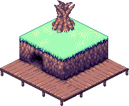> > Suggestions?Shadow underlying the snow is to dark and distinctive.Oh, that's grass, maybe the grass is a little… Vivid?I really like the shadowing/lighting in the cave, I've tried this recently myself and know how hard it can be to get a decent result like that.Very nice work with the dock/bridge/wooden path. Link to comment Share on other sites More sharing options...
ddunit Posted June 7, 2009 Share Posted June 7, 2009 Bonga, it's how the style is supposed to be Link to comment Share on other sites More sharing options...
Richy420Rich Posted June 7, 2009 Share Posted June 7, 2009 IMO I think the grass just needs a darker shade, I like the little touches of yellow, as it might bring it out better with a darker shade of grass. Cave entrance and cave wall looks nice, as well as the bridge. Link to comment Share on other sites More sharing options...
Bongartist Posted June 7, 2009 Share Posted June 7, 2009 Yeah, I get that DDuN, after I posted, I still think it's a bit vivid though.All in all nice work Slym definitely 8/10, maybe 9/10 if you darken the sahde of that grass. Link to comment Share on other sites More sharing options...
Guest Posted June 7, 2009 Share Posted June 7, 2009 26 colors (including transparency. 25 without). This is NOT the same scene.Removed, thanks to rippers. Link to comment Share on other sites More sharing options...
Hippoman789 Posted June 7, 2009 Share Posted June 7, 2009 besides the sprite being too bulky, the grass is way to bright. and in your words, it causes eye strain. Link to comment Share on other sites More sharing options...
Bongartist Posted June 7, 2009 Share Posted June 7, 2009 @[ð:> slym¸ link=topic=45903.msg466307#msg466307 date=1244341506]> 26 colors (including transparency. 25 without). This is NOT the same scene.> > I like the scene, te sprites not to hot, and not my style but, I like the scene a lot.9/10 for the scene 6/10 for the sprite.Keep it coming! Link to comment Share on other sites More sharing options...
ddunit Posted June 7, 2009 Share Posted June 7, 2009 How sick, a guy about to suicide - naked!@ Link to comment Share on other sites More sharing options...
Techno 5.0 Posted June 7, 2009 Share Posted June 7, 2009 @DDuÃ˜à ¼Ât:> How sick, a guy about to suicide - naked!@rofl.looks nice slymthe grass is to bright Link to comment Share on other sites More sharing options...
Guest Posted June 8, 2009 Share Posted June 8, 2009 Removed, thanks to rippers.Tried another grass texture I made. Really liking it now. Changed sprite, (ignore head, it will have hair, back of it is really duck up). Link to comment Share on other sites More sharing options...
zade_o Posted June 8, 2009 Share Posted June 8, 2009 the entrance to the cave in that one looks realllllly nice slym. maybe just don't use a purple shade though? i don't really like the purple.the grass seems more like he's in a field of dandelions though Link to comment Share on other sites More sharing options...
Guest Posted June 8, 2009 Share Posted June 8, 2009 Lol yeah I need to take off the darker shade in the grass. That way it looks more grass-like. With the purple shades, I think it is just the brighter purple shades that are annoying, but I'll try other shades as well. Link to comment Share on other sites More sharing options...
zade_o Posted June 8, 2009 Share Posted June 8, 2009 Yeah maybe just the brighter one. It just doesn't transition right from sand colors to purple haha but still, overall that's a professional looking job Link to comment Share on other sites More sharing options...
Drummerpete Posted June 8, 2009 Share Posted June 8, 2009 Slym, beautiful work as always.Give me your pixel powers!! Link to comment Share on other sites More sharing options...
xeross Posted June 14, 2009 Share Posted June 14, 2009 They look great, They've got a great vibe to em. Except the sprites.Regards, Xeross Link to comment Share on other sites More sharing options...
Bongartist Posted June 16, 2009 Share Posted June 16, 2009 Yeah, excellent quality Slym, kudos. Link to comment Share on other sites More sharing options...
Sealbreaker Posted June 23, 2009 Share Posted June 23, 2009 i dont like the grass too much, but the rest is awesome! =)wish i could be as good as you :icon_alabanza: Link to comment Share on other sites More sharing options...

Recommended Posts
Create an account or sign in to comment
You need to be a member in order to leave a comment
Create an account
Sign up for a new account in our community. It's easy!
Register a new accountSign in
Already have an account? Sign in here.
Sign In Now