shadowwulf Posted January 5, 2009 Author Share Posted January 5, 2009 I am new to gfx art to begin with but here is a first try at using paint.net to make a map. I read through a tutorial that i now think is crap after making this. but please tell me what you think.remember its a rough/first attempt mainly to get the feel for the program, but also any pros out there that can tell exactly what i did, please offer contructive alternatives. Link to comment Share on other sites More sharing options...
Homicidal Monkey Posted January 5, 2009 Share Posted January 5, 2009 I see a hamburger in the leftmost continent. Link to comment Share on other sites More sharing options...
shadowwulf Posted January 5, 2009 Author Share Posted January 5, 2009 rofl. it was just an attempt at trying to make some mountainst and forests. but texture wise is it ok?I am trying to figure out how to make the forests and mountains not have such a definate shape to them Link to comment Share on other sites More sharing options...
Falnax Posted January 5, 2009 Share Posted January 5, 2009 Well, as a long time follower of the whole Crystal Genesis project, I decided to take a stab at the map…I rarely do my maps as textural representation, but thought it seemed like an interesting project, anyways.Obviously, it's the same map you posted, but with slightly redrawn borders and textures. Check it out. Tiny version is preview only, real map is the link below it: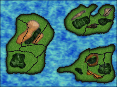http://i357.photobucket.com/albums/oo14/Amperglyph/Reindex.png Link to comment Share on other sites More sharing options...
shadowwulf Posted January 6, 2009 Author Share Posted January 6, 2009 nice edit… how did you get those textures? Link to comment Share on other sites More sharing options...
Falnax Posted January 6, 2009 Share Posted January 6, 2009 Using my usual technique, which is to photograph things and process those into textures…which is a complex and rarely the same set of sampling, color adjusting, scrambling, and such until it looks sufficiently arbitrary. Grasslands and mountains were both patterns I made a while back, forest was a new one for this map, but I've definitely had others turn out better. Mountain also had some low-opacity beveling in order to give it the "shape." Ocean texture was actually just the original, but at a different scale with some color tweaks.Generally, when texturing things, you want to have diversity in the textures. Because you used the same texture on every surface for the original map, it became much weaker, say, when done in black and white (Which would be a dealbreaker if you want to publish it in a book). The pattern diversity of the edit allows it to carry equal information whether the colors are present or not.By the way, if you're looking for anything else, like minor changes, labels, stuff like that, I'd be happy to do them for you. Just make sure to give me credit, that's all I ask. Link to comment Share on other sites More sharing options...
shadowwulf Posted January 6, 2009 Author Share Posted January 6, 2009 hmmm if i did some really crappy(i would be giving an honest try though) conceptual designs in paint… would you be willing to do them?I would only be able to offer full credit when it comes to the game...If i add it(them) to the book as full color 2 page spreads... then maybe we can work something out if you want more than just credit.(i did sell one sample work! lol) Link to comment Share on other sites More sharing options...
Baron Posted January 6, 2009 Share Posted January 6, 2009 @Simius:> I see a hamburger in the leftmost continent.but of course, its the home of the Hamburgian army… Link to comment Share on other sites More sharing options...
Falnax Posted January 6, 2009 Share Posted January 6, 2009 @Simius:> I see a hamburger in the leftmost continent.I love the way that my editing has done very little to discourage the idea that it is, in fact, a hamburger. Link to comment Share on other sites More sharing options...
mrmiguu Posted January 6, 2009 Share Posted January 6, 2009 I just want to eat your map up Amperglyph (lol kidding) It looks great, and great concept for the map layout Shadowwulf. I like it, it allows players to be able to travel across continents. Link to comment Share on other sites More sharing options...
shadowwulf Posted January 6, 2009 Author Share Posted January 6, 2009 rofl. was a bunch of random shaped to be honest…my suprise is no one else thought the SE continent was a grunt from Halo...EDIT: in regards to MrMiguu's comment- I plan on completing a small continent fully... it will have all the major aspects thoguh such as, plenty of wilderness to roam free in(more like get yourself utterly lost in), many areas of civilization from small towns stranded in the wilderness, to great kingdoms decked out medieval style with outerwall peasent living, inner plots for lords and vassels, and of course the castle for the king.I am unsure at this point if I will make the kingdoms some kind of rewards for active players... or maybe guilds... would be interesting to see a guild have a kingdom rather than a small guild hall...If you are thinking about awesome raids and castle seiges... stop, you will ruin one of the great suprises... :) Link to comment Share on other sites More sharing options...
Dark Crusade Posted January 6, 2009 Share Posted January 6, 2009 Lmao it all looks like food to me. Link to comment Share on other sites More sharing options...
mrmiguu Posted January 6, 2009 Share Posted January 6, 2009 The one thing it doesn't have is a well blended transition between the actual land and the sea, If that was better it might not taste so good. Link to comment Share on other sites More sharing options...
Falnax Posted January 6, 2009 Share Posted January 6, 2009 @MrMiguuâ„¢:> The one thing it doesn't have is a well blended transition between the actual land and the sea, If that was better it might not taste so good.Um…I honestly can't comprehend the meaning of that phrase...I don't really see how an improvement would make it taste worse. But, I'll agree that the disagreement between the appearance of the land and that of the sea was my biggest disappointment coming out of this map. May put in a little more work to fix that, if Shadowwulf asks for it.EDIT: Seems like I missed a few things, here and there...what I had thought was one reply was actually four.Also, in response to the southeast continent thing, I thought it was a cardinal. Northeast looks like an arm making a thumbs-up... Link to comment Share on other sites More sharing options...
Dark Crusade Posted January 6, 2009 Share Posted January 6, 2009 I'm sure he means that if he fixed up the transition issues, then it wouldn't look so much like food. Link to comment Share on other sites More sharing options...
mrmiguu Posted January 6, 2009 Share Posted January 6, 2009 @Amperglyph:> Um…I honestly can't comprehend the meaning of that phrase...I don't really see how an improvement would make it taste worse. But, I'll agree that the disagreement between the appearance of the land and that of the sea was my biggest disappointment coming out of this map. May put in a little more work to fix that, if Shadowwulf asks for it.> > EDIT: Seems like I missed a few things, here and there...what I had thought was one reply was actually four.> > Also, in response to the southeast continent thing, I thought it was a cardinal. Northeast looks like an arm making a thumbs-up...Well that was supposed to be a metaphor to make it look more realistic, as in not taste so good. lol sorry if I confused you. Anyways It looks great and I think it looks fine as it is, but the actual layout makes it literally look like food on a plate. Link to comment Share on other sites More sharing options...
Dark Crusade Posted January 6, 2009 Share Posted January 6, 2009 Woo, I was right! Link to comment Share on other sites More sharing options...
shadowwulf Posted January 6, 2009 Author Share Posted January 6, 2009 this isnt the actual layout. I am honored that Amperglyph took on making it look better, but i am concerned about making the full map available to anyone as i would hope to keep the possible other continents a suprise…maybe... idk.all i know is i suck at shaping and texturing and transitioning the areas.... Link to comment Share on other sites More sharing options...
Anna Comnena Posted January 8, 2009 Share Posted January 8, 2009 I think the main problem is you have basically the same texture (or atleast texture style) for every geographical feature. Plains look different than mountains, and forests, and oceans, more so than their simple color. The second map was really nice in this regard; the only thing I didn't like is the political borders are distinct and stand out; they should blend more so you can see the geography under them.But anyway, I prefer the simulated "ink on paper" drawn style of map, like I did for Seven Nations: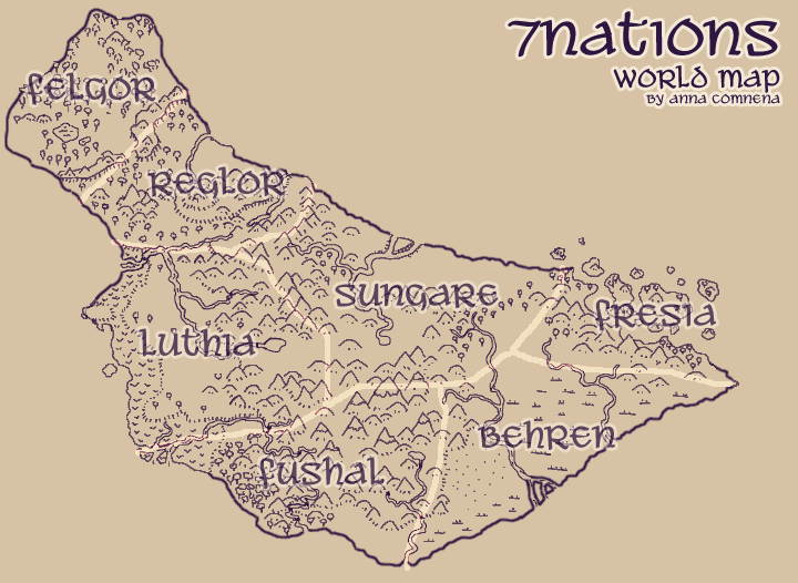 Link to comment Share on other sites More sharing options...
Falnax Posted January 8, 2009 Share Posted January 8, 2009 @Anna:> But anyway, I prefer the simulated "ink on paper" drawn style of map, like I did for Seven Nations:Right, I had mentioned that I wasn't too into the idea of textured representation, which seems to be generally what people in the independent game industry use…I usually like to make my maps look like they've been drawn on paper, as you demonstrated. Not to mention that I try to come up with more random shapes than seen here; I wanted to completely reshape the western continent, but was worried about how that might affect his game design. I'll definitely see what I can do about more delicate political boundaries, though...wasn't really taking them too seriously this time.Just a random note, though...Shadowwulf, you mentioned that the continent shapes you used were just random ideas, which seems to conflict with the fact that the title is "Actual Map for the continents." Link to comment Share on other sites More sharing options...
Tyr Posted January 8, 2009 Share Posted January 8, 2009 i know this is a bit off topic, but Anna. why did 7nations quit? Link to comment Share on other sites More sharing options...
ddunit Posted January 8, 2009 Share Posted January 8, 2009 @Tyr:> i know this is a bit off topic, but Anna. why did 7nations quit?What about ToA D: Link to comment Share on other sites More sharing options...
Kusy Posted January 8, 2009 Share Posted January 8, 2009 @Anna:> But anyway, I prefer the simulated "ink on paper" drawn style of map, like I did for Seven Nations:> cough… cough... Tolkien... cough. Link to comment Share on other sites More sharing options...
Anna Comnena Posted January 9, 2009 Share Posted January 9, 2009 What about Tolkien? He invented monochrome maps now? Link to comment Share on other sites More sharing options...
Dark Crusade Posted January 19, 2009 Share Posted January 19, 2009 @Irhymer:> Oh my freakin, ha ha ha ha ha ha ha ha ha ha :laughing4: i….cant...breath..... help> beeeeeeeeeeeeeeeeeeeeeeeeeeeeeeeeeeeeeeeeeepppppppppppppppppppppppppppppppppppppppppppppppppppppppppppppppppppp. :violent4:Warned for spam. Was it necessary you posted that? Link to comment Share on other sites More sharing options...

Recommended Posts
Create an account or sign in to comment
You need to be a member in order to leave a comment
Create an account
Sign up for a new account in our community. It's easy!
Register a new accountSign in
Already have an account? Sign in here.
Sign In Now