Harris6310 Posted June 1, 2010 Author Share Posted June 1, 2010 I am trying to improve myself in making graphics. So I was looking at Robin's GUI he posted for EO. And I was wondering if I was able to make borders as good as that. So I took his as inspiration and made my own. Here it is:Old:Update:2nd Update:3rd Update: Link to comment Share on other sites More sharing options...
Sowtis Posted June 1, 2010 Share Posted June 1, 2010 Not bad, maybe its a wee bit too thick? I don't know.7/10 Link to comment Share on other sites More sharing options...
Robin Posted June 1, 2010 Share Posted June 1, 2010 It takes more than a nice border to make a GUI. You need to create something that melds well with the rest of the graphics as well as a decent layout.Borders are easy to make. Rectangle of colour, 1px outline, 1px inner glow, texture overlay. Link to comment Share on other sites More sharing options...
Harris6310 Posted June 1, 2010 Author Share Posted June 1, 2010 Okay, I have updated it, this time working a bit more than the borders. Link to comment Share on other sites More sharing options...
Robin Posted June 1, 2010 Share Posted June 1, 2010 Too clean now. Add some blending, sort out some shadows and stuff.Shadows make everything look better. Link to comment Share on other sites More sharing options...
azure Posted June 1, 2010 Share Posted June 1, 2010 merge the first with the second. Make the first version your background and the red textures the background of you center box. :| Link to comment Share on other sites More sharing options...
Robin Posted June 1, 2010 Share Posted June 1, 2010 Yup, and then you'll have a clone of my GUI.Well done? xD Link to comment Share on other sites More sharing options...
zade_o Posted June 1, 2010 Share Posted June 1, 2010 meh, looks like all the simplistic guis I see come from … I wanna say zoso, rory, and robin? Don't quote me on that, I just THINK that it was their games that I always felt had the same GUI with a different color scheme.No offense to them or you, it's not a bad gui or anything, just plain and too common.(don't flame me if i'm wrong about the people I listed, I admit I could be wrong) Link to comment Share on other sites More sharing options...
Marsh Posted June 1, 2010 Share Posted June 1, 2010 Rory makes robins gui's and maybe zoso's to. Which would explain why that is. Link to comment Share on other sites More sharing options...
azure Posted June 1, 2010 Share Posted June 1, 2010 It was just a suggestion to make it look presentable. :| Besides if their not willing to move the stuff around on the form and really tweak it to be original it's always just going to be a clone. Link to comment Share on other sites More sharing options...
zade_o Posted June 1, 2010 Share Posted June 1, 2010 Oh so I was correct then lol.It would make it presentable, and it's semi-presentable now. It's just that it seems like this look should just be the generic GUI for RPG makers. There's nothing unique about it, nothing that sets a mood for your game. Link to comment Share on other sites More sharing options...
Harris6310 Posted June 1, 2010 Author Share Posted June 1, 2010 I have updated it again. Changed the red, added shadows, little button thingy and added some text. For some weird reason the anti-alias on the font isn't working properly. I might develop this into a full GUI and use it for my game. Link to comment Share on other sites More sharing options...
Techno 5.0 Posted June 1, 2010 Share Posted June 1, 2010 i remember slym made some designs coming out of the GUI and over the picturethat made his look pretty nicemaybe you can try something like that? Link to comment Share on other sites More sharing options...
zade_o Posted June 1, 2010 Share Posted June 1, 2010 ew…work on the shadows a bit man. the one around the border is fine, but around the text it kills the whole GUI. and the button seems very out of place, and has a shadow almost as bad as the text one. Link to comment Share on other sites More sharing options...
Robin Posted June 1, 2010 Share Posted June 1, 2010 Rory makes my GUIs, ZoSo makes his own.They have similar aspects, but I think they're all very unique.**Rory's Nin Online GUI:****Rory & I collaborated on the WN GUI:**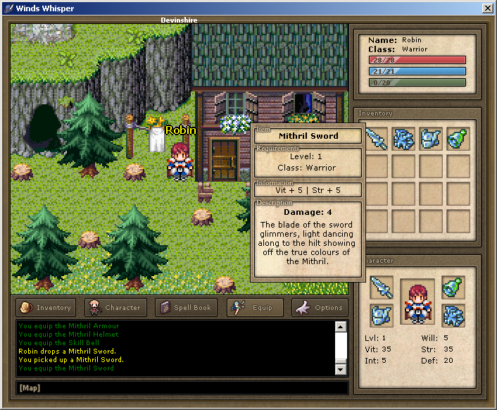**ZoSo & I collaborated on the SD GUI:** Link to comment Share on other sites More sharing options...
Marsh Posted June 1, 2010 Share Posted June 1, 2010 The new update looks nice though i wouldnt have the box on the top overlap the other border. Just comes out looking wierd. Link to comment Share on other sites More sharing options...
azure Posted June 1, 2010 Share Posted June 1, 2010 Also I'd connect the inner and outer boxes in one or two places to make them appear to be one piece. Link to comment Share on other sites More sharing options...
Harris6310 Posted June 1, 2010 Author Share Posted June 1, 2010 Now I have changed the text from having a glow to a drop shadow and I merged the button with the border. I still cant seem to fix the font though.Edit:@Azure:> Also I'd connect the inner and outer boxes in one or two places to make them appear to be one piece.The borders? Link to comment Share on other sites More sharing options...
azure Posted June 1, 2010 Share Posted June 1, 2010 I don't mean literally merge them. I mean to add parts that connect them. Yes the borders. Link to comment Share on other sites More sharing options...
Robin Posted June 1, 2010 Share Posted June 1, 2010 That font is disgusting. Link to comment Share on other sites More sharing options...

Recommended Posts
Create an account or sign in to comment
You need to be a member in order to leave a comment
Create an account
Sign up for a new account in our community. It's easy!
Register a new accountSign in
Already have an account? Sign in here.
Sign In Now