Jeff Posted January 4, 2012 Share Posted January 4, 2012 That sand looks like shit. I'd suggest that you make the colors have less contrast first, and then work on the sand-water transition. A good direction for the sand-water transition might be to just have a solid line(no dithering) and it slowly gets darker. I'd probably change the texture of your sand too. Link to comment Share on other sites More sharing options...
SawQuart Posted January 5, 2012 Share Posted January 5, 2012 @Whack:> Reminds me of H&H so much, **but looks better**.wutThat sand looks terrible. Did you just use the spray can tool? Link to comment Share on other sites More sharing options...
Dark Crusade Posted January 5, 2012 Share Posted January 5, 2012 @Relly:> Yes actually xD. I was wondering when someone would notice. (the birch trees gave it away I'm sure)Yup sure did, then I looked at the house and cobblestone. :P Link to comment Share on other sites More sharing options...
SawQuart Posted January 5, 2012 Share Posted January 5, 2012 @Kreator:> Yup sure did, then I looked at the house and cobblestone. :PThe guy carrying the log was my first clue. The second was the boat, mine hole, and house. Link to comment Share on other sites More sharing options...
Relly Posted January 5, 2012 Author Share Posted January 5, 2012 To me, sand is grainy, and so that's how I portrayed it. I do want to make a shore-type edge, like the foam of water at the beach, though. Link to comment Share on other sites More sharing options...
Jeff Posted January 6, 2012 Share Posted January 6, 2012 @Relly:> To me, sand is grainy, and so that's how I portrayed it. I do want to make a shore-type edge, like the foam of water at the beach, though.but it looks ugly and doesn't match the quality of the other tiles. Make it slightly smoother. The dark spots are too dark. Link to comment Share on other sites More sharing options...
Relly Posted January 6, 2012 Author Share Posted January 6, 2012 Is it just me or does this have dark spots in it? Link to comment Share on other sites More sharing options...
SawQuart Posted January 7, 2012 Share Posted January 7, 2012 Look at some pre-existing tilesets first:EDIT:I have no idea what that purple thing is. Link to comment Share on other sites More sharing options...
Myron Posted January 7, 2012 Share Posted January 7, 2012 Clean sand is clean. Link to comment Share on other sites More sharing options...
ark0n Posted January 7, 2012 Share Posted January 7, 2012 Dude, i really love the dungeon for some reason. Link to comment Share on other sites More sharing options...
fortunato Posted January 7, 2012 Share Posted January 7, 2012 @Relly:> Yes actually xD. I was wondering when someone would notice. (the birch trees gave it away I'm sure)> > As for the dungeon floor, I did notice it wasn't as dark as I thought it was. (I made 'em a while back)> > New stuff:> hello, nice work so far.first off, you should try to not save as a .jpg for pixel art. one of the only used for saving pixel art in a .jpg format is to possibly prevent people from stealing your pixel art. but you shouldn't worry about that; when saving your tiles to display on the web try to save them in **.png**, a higher quality image format. otherwise save them as .bmp or any other high quality image format (such as .psd if in photoshop) if you're just saving them on your computer.(EDIT: sorry, read one of your posts and it said it was intentional. though i don't understand why some are .jpg and some are not it seems? and also, the advice still stands. it's hard to judge/critique pixel art when it's in .jpg/quality-distorting form)some problems that you have is that your tiles have a bit of a contrast issue. try to increase the contrast between colors on your tiles. if a color seems to be "too close" to another color (as in a color is too similar to another one), take it out. you don't need it; you can just use the other similar color and replace it. i don't know if you're doing that in your latest work because i can't accurately count the colors as it is a .jpg.an issue that you can work on also is your sand-to-water transition. it's a bit inaccurate right now. look at the way water washes up on a beach: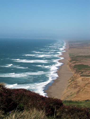in this image's case, the seawater is foaming up towards the shore, and its spilling (for lack of a better word) out onto the sand. in your picture, it does not do this. instead, it appears as though the sand is just "breaking up" over the water and actually gives an appearance of possibly floating over the water. this is not correct, or rather, is not how real beaches play out. if you want to make it look a bit more natural, you should realize that the water is actually flowing OVER the beach/sand, and is doing things like foaming up, spreading out like a liquid, etc. try to look at a few pictures of beaches and shores to get the hang of what they look like, and then have a go at your tiles.try out these things, and just post if you have any questions. try saving your image in .png format too, so we can really take a look at your tiles in higher quality. wish you the best of luck. :) Link to comment Share on other sites More sharing options...
aaaron Posted January 7, 2012 Share Posted January 7, 2012 They meant to save it in JPG. Link to comment Share on other sites More sharing options...
fortunato Posted January 7, 2012 Share Posted January 7, 2012 @Aáron:> They meant to save it in JPG.yeah, saw that. edited my first post.to Relly: i'm guessing its so people don't steal the pixels? as i said in my other post, it's hard to judge pixel art properly in .jpg format because it distorts the quality integrity of the image, as in we don't see the proper colors and such (and pixel art is about having the most control of what your image looks like down to the pixel, so if the image is distorted out of the artist's control then it's not really pixel art). i know you can probably see your images in higher quality in files that you have but we can't. i'd definitely like to help/critique with the highest quality image examples possible. though i'm not going to pressure you at all; if you don't want to post .pngs or something like that that's totally fine, as that's you're choice. just saying, proper critique can only happen if your images aren't .jpg/distorted IMO… Link to comment Share on other sites More sharing options...
Relly Posted January 7, 2012 Author Share Posted January 7, 2012 @fortunatoWell it seems that everyone else didn't mind, and some Eclipsians love stealing work (past experience), so I'ma stick with jpegs. You only mentioned things that were already addressed, I said I was going to make a water-sand transition tile already x_x.@JungleI don't really like to look at pixel art to do pixel art, It just doesn't seem right. I guess I'll _have_ to at least try to make a new sand because of the amount of complaining, but I remember having a hard time with it.First Attempt: Link to comment Share on other sites More sharing options...
fortunato Posted January 7, 2012 Share Posted January 7, 2012 @Relly:> @fortunato> Well it seems that everyone else didn't mind, and some Eclipsians love stealing work (past experience), so I'ma stick with jpegs. You only mentioned things that were already addressed, I said I was going to make a water-sand transition tile already x_x.> First Attempt:> ah, well that makes sense. and ah sorry bout that, i re-read and saw what you said about the water-sand transition; i guess it pays to read the whole topic! O_O my bad. perhaps i could make up for it by offering some more tips.you're partly right to not want to look at pixel art to do pixel art. this is a good value to start off with especially if you are new to art, because doing things like trying to learn how to draw a tree from someone else's pixel art/drawing of a tree won't help you much; the thing that would help you the most is learning how to draw a tree by drawing an actual tree. but what can help you is learning pixel-ing techniques by studying the pixel art of others (i.e. dithering styles, how they shade certain things, color usage etc.). this is a great way to learn how to make your pixels look very interesting.nice first attempt to the tile. something that's going on with the tile right now is that i see a grid pattern repeated. i've highlighted some of the gridlines for you here, next to your original image: you can tell where the tiling takes place. having the obvious tiling can give your art/game/maps more of a grid looking effect, making it look less interesting and projects less of a convincing environment, if that makes sense. real life has a lot of variation, especially things like sand and grass. one way to fix this would be to keep going at editing the sand tile until the "grid lines" disappear, but thats somewhat time consuming and a bit difficult. instead, another method to do is to make one tile, copy it, take out an inner "chunk" and keep the borders, then pixel a new inside chunk in. if that doesn't make any sense the process is outlined here (in a nice fancy image):http://www.wayofthepixel.net/pixelation/index.php?topic=9865.msg107103#msg107103i personally believe that this is the best way to get rid of a "tiling grid" because you don't have to worry about re-editing little details in tiles over and over, and you get a bunch of different variations of a tile to work with, so your maps will look more interesting, varied, and realistic. again, good luck… good choice on making your own custom tile set... leads to a more individual and interesting game :thumbsup: Link to comment Share on other sites More sharing options...
Relly Posted January 7, 2012 Author Share Posted January 7, 2012 Gawsh such long replies.. ;PAnyway I didn't even notice the grid until you pointed it out, I'll get that fixed.Which color is better?  Link to comment Share on other sites More sharing options...
SawQuart Posted January 7, 2012 Share Posted January 7, 2012 @Relly:> Gawsh such long replies.. ;P> > Anyway I didn't even notice the grid until you pointed it out, I'll get that fixed.> > Which color is better?>  Show it in game so that we can judge it.Also, isn't it a bit pointless to use JPG if we can easily just go into your game and screenshot it anyways? Link to comment Share on other sites More sharing options...
Relly Posted January 7, 2012 Author Share Posted January 7, 2012 Looks too simple to me. Link to comment Share on other sites More sharing options...
guzmanm Posted January 7, 2012 Share Posted January 7, 2012 Use the darker one. The brighter one stands out too much for my eyes. Link to comment Share on other sites More sharing options...
Relly Posted January 7, 2012 Author Share Posted January 7, 2012 The darker one then: Link to comment Share on other sites More sharing options...
Murdoc Posted January 7, 2012 Share Posted January 7, 2012 Better transition to water now Link to comment Share on other sites More sharing options...
guzmanm Posted January 7, 2012 Share Posted January 7, 2012 @Relly:> The darker one then:> > >! the water in the previous screenie looked better. Link to comment Share on other sites More sharing options...
Relly Posted January 7, 2012 Author Share Posted January 7, 2012 Not sure which water is liked more, personally I like the first water tile.@JungleMeh, if people download the game and work to rip the graphics, I'll have to let them (of course that doesn't make it right). But I won't let them waltz onto a graphic thread, right click, and have my graphics with no trouble at all.Vote on water!  1 2 Link to comment Share on other sites More sharing options...
Whackeddie99 Posted January 7, 2012 Share Posted January 7, 2012 2 for sure Link to comment Share on other sites More sharing options...
Lenton Posted January 7, 2012 Share Posted January 7, 2012 Definitely the second tile.The water transition should be a froth on the edges:>! Actually, that might be a bit of an overkill. This is a better example:>! I also prefer the lighter sand. Link to comment Share on other sites More sharing options...

Recommended Posts
Create an account or sign in to comment
You need to be a member in order to leave a comment
Create an account
Sign up for a new account in our community. It's easy!
Register a new accountSign in
Already have an account? Sign in here.
Sign In Now