Dreams Posted April 10, 2013 Share Posted April 10, 2013 I've tried gimp out, and I think it's really nice, but there's some key things that I can't figure out how to do, and I'm too lazy to learn Also, I just got a new computer which = more downloads  Link to comment Share on other sites More sharing options...
johnlfs Posted April 10, 2013 Share Posted April 10, 2013 All right.>! First: my drawing.>! >! >! And (click to resize, the forum fÂuck my draw)>! >!  Link to comment Share on other sites More sharing options...
Yuko Posted April 10, 2013 Author Share Posted April 10, 2013 > All right.> > > >! First: my drawing.> >! >! > >! And (click to resize, the forum fÂuck my draw)> >! >! Wow really amazing. I love it!!! Link to comment Share on other sites More sharing options...
Marsh Posted April 10, 2013 Share Posted April 10, 2013 Damn that background is sweet! Good Job. Link to comment Share on other sites More sharing options...
Fogger Posted April 10, 2013 Share Posted April 10, 2013 > All right.> > > >! First: my drawing.> >! >! > >! And (click to resize, the forum fÂuck my draw)> >! >! That looks awesome! Reminds me a lot of the final fantasy logos. Link to comment Share on other sites More sharing options...
johnlfs Posted April 10, 2013 Share Posted April 10, 2013 > That looks awesome! Reminds me a lot of the final fantasy logos.is because I work for Square EnixAnd I'm a big fan of the FF series. Link to comment Share on other sites More sharing options...
Dr.House Posted April 10, 2013 Share Posted April 10, 2013 Awesome dude, I work for Gameloft.Very cool pic. I'll vote for you. Link to comment Share on other sites More sharing options...
Yuko Posted April 10, 2013 Author Share Posted April 10, 2013 We have a lot of time before voting will begin.- Small Update, First place will receive a GUI Design Trophy.- If you plan to make a GUI, don't be rushed, you have quite a bit of time. Voting begins in May, so you have a few weeks to get your entry in.- To get your GUI in the vote thread, you must have a fully completed GUI, or you must guarantee to me or Marshy Dearest that you will finish the design.Thank You,Cici Link to comment Share on other sites More sharing options...
Jeff Posted April 11, 2013 Share Posted April 11, 2013 > All right.That drawing is beautiful, but the GUI looks a little amateurish. First, the 'Eclipse++' text isn't centered very well, even though it appears to be centered the + signs don't have as much visual interest as the rest of the text does. Honestly if you make cooler plus signs it'd probably look better. Also, the text next to the check boxes doesn't look very good, it's too small for that font. Try making it solid color, or even changing fonts altogether. Even the username and password boxes don't look as good as they should because of the font. Why does the top right corner's border have more weight than the rest of the borders?The bevel on the main window also doesn't look very good, generally bevels don't though. Honestly the whole main window doesn't look very good, the font is really boxy while the window is round. The 80% or so white opacity doesn't look too good either, really. Maybe try a purple border around the main window, like the border around the text? The shadow thing looks pretty incongruous.Hope to see some updates. Link to comment Share on other sites More sharing options...
Nerva Posted April 11, 2013 Share Posted April 11, 2013 I might give it a go, but I have 0 experience making GUI's in eclipse format. Link to comment Share on other sites More sharing options...
johnlfs Posted April 11, 2013 Share Posted April 11, 2013 > That drawing is beautiful, but the GUI looks a little amateurish. First, the 'Eclipse++' text isn't centered very well, even though it appears to be centered the + signs don't have as much visual interest as the rest of the text does. Honestly if you make cooler plus signs it'd probably look better. Also, the text next to the check boxes doesn't look very good, it's too small for that font. Try making it solid color, or even changing fonts altogether. Even the username and password boxes don't look as good as they should because of the font. Why does the top right corner's border have more weight than the rest of the borders?> > The bevel on the main window also doesn't look very good, generally bevels don't though. Honestly the whole main window doesn't look very good, the font is really boxy while the window is round. The 80% or so white opacity doesn't look too good either, really. Maybe try a purple border around the main window, like the border around the text? The shadow thing looks pretty incongruous.> > Hope to see some updates.Blá blá blá…Make better.1 - Centralize Eclipse and it will be ugly. You know nothing about design;2 - The text beside the boxes follows the standard design, you probably did not open on DPIs enough to see them right, I indicate download the image or replace your video card. Or maybe your Eye...3 - Weight? all the weight of the image is on the left side, you need a scale? I have one;4 - There is no transparency, the box is leaked, you need glasses and study design maybe;5 - Not there are shadows, I said, your eyes or your video card;Make something better and then say something, or perhaps study as much as I to give his view about things. Link to comment Share on other sites More sharing options...
Voo Posted April 12, 2013 Share Posted April 12, 2013 > Blá blá blá…Make better.> > 1 - Centralize Eclipse and it will be ugly. You know nothing about design;> > 2 - The text beside the boxes follows the standard design, you probably did not open on DPIs enough to see them right, I indicate download the image or replace your video card. Or maybe your Eye...> > 3 - Weight? all the weight of the image is on the left side, you need a scale? I have one;> > 4 - There is no transparency, the box is leaked, you need glasses and study design maybe;> > 5 - Not there are shadows, I said, your eyes or your video card;> > Make something better and then say something, or perhaps study as much as I to give his view about things.Dude, ego it up. I love that you feel so confident in your design, jut be a bit nicer about telling people off. Otherwise, your points are valid. – Although I agree the buttons and general layout is real iffy.Anyways, I was wondering if we could submit 2 UI's? Like same UI, but two different styles? Link to comment Share on other sites More sharing options...
Wing Posted April 12, 2013 Share Posted April 12, 2013 I asked Marshy Dearest earlier and he said multiple entries is fine. Link to comment Share on other sites More sharing options...
Voo Posted April 12, 2013 Share Posted April 12, 2013 Oh, cool beans. Link to comment Share on other sites More sharing options...
Yuko Posted April 12, 2013 Author Share Posted April 12, 2013 > Dude, ego it up. I love that you feel so confident in your design, jut be a bit nicer about telling people off. Otherwise, your points are valid. – Although I agree the buttons and general layout is real iffy.> > Anyways, I was wondering if we could submit 2 UI's? Like same UI, but two different styles?I suppose it wouldn't hurt, but I think we'll take your best one overall for the final vote. Link to comment Share on other sites More sharing options...
Voo Posted April 12, 2013 Share Posted April 12, 2013 Here's some more updates to the ui as of yet. I probably will end up making two, just because I'm not completely satisfied with this style.>! 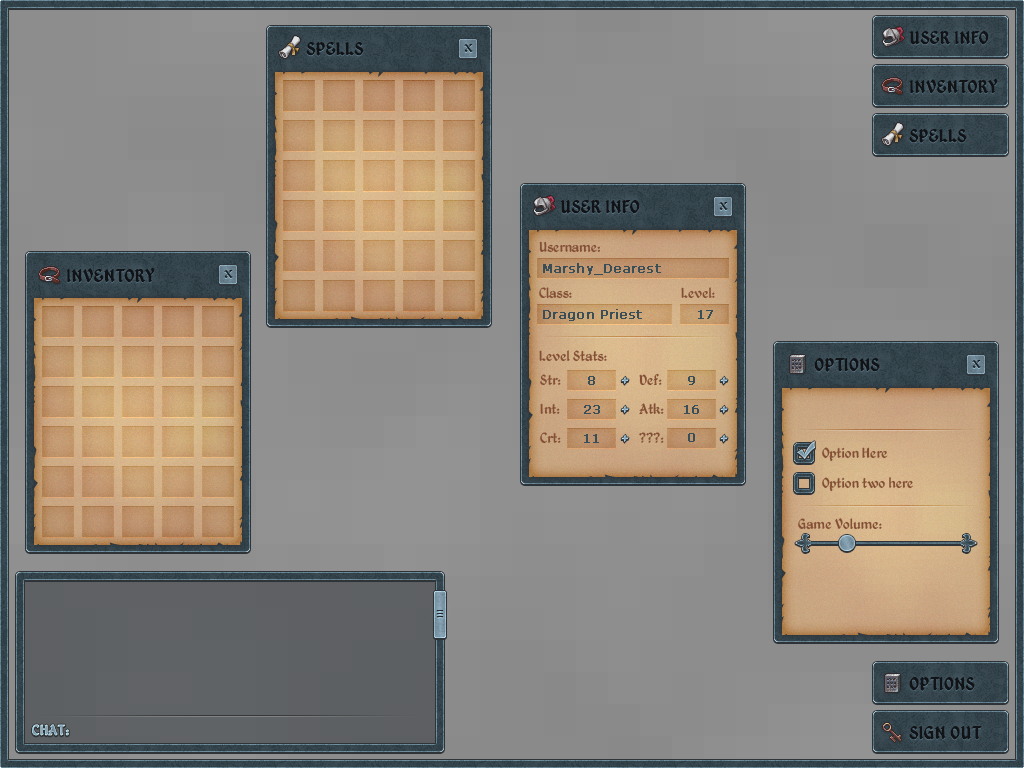>! 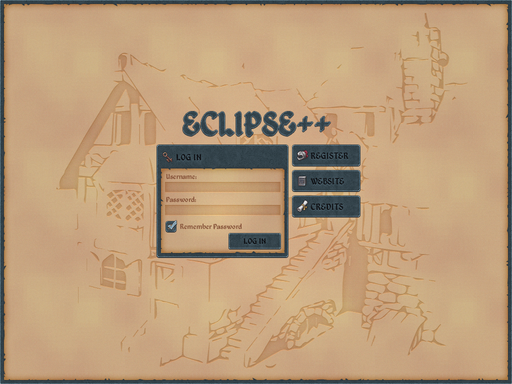 Link to comment Share on other sites More sharing options...
Wing Posted April 12, 2013 Share Posted April 12, 2013 Love it. Link to comment Share on other sites More sharing options...
Yuko Posted April 12, 2013 Author Share Posted April 12, 2013 > Here's some more updates to the ui as of yet. I probably will end up making two, just because I'm not completely satisfied with this style.> > > >! > >! Eh…Errr.Umm...Maybe...EhhJk love it  Link to comment Share on other sites More sharing options...
johnlfs Posted April 12, 2013 Share Posted April 12, 2013 I wonder if the theme is fantasy or medieval. -. Link to comment Share on other sites More sharing options...
Yuko Posted April 12, 2013 Author Share Posted April 12, 2013 It says fantasy in the contest, depends what Marshy Dearest says. Link to comment Share on other sites More sharing options...
Marsh Posted April 12, 2013 Share Posted April 12, 2013 > Here's some more updates to the ui as of yet. I probably will end up making two, just because I'm not completely satisfied with this style.> > > >! > >! Looking really solid man. Good job. Link to comment Share on other sites More sharing options...
Marsh Posted April 14, 2013 Share Posted April 14, 2013 Hey if anyone wants to do me a favor XD. I forgot to mention i need one that has item Eqiups. So i can eqiup weapons and armor and such.http://www.fiestaonline.net/image/guide/img_beginner_control06.jpgsomething like that.Need it to haveHelmetArmorBootsNecklace2 RingsWeaponShield Link to comment Share on other sites More sharing options...
barreytor Posted April 15, 2013 Share Posted April 15, 2013 > Hey if anyone wants to do me a favor XD. I forgot to mention i need one that has item Eqiups. So i can eqiup weapons and armor and such.> > [http://www.fiestaonl…r_control06.jpg](http://www.fiestaonline.net/image/guide/img_beginner_control06.jpg)> > something like that.> > Need it to have> > Helmet> > Armor> > Boots> > Necklace> > 2 Rings> > Weapon> > ShieldSomething like this?>! Just one question: JPG or PNG? Link to comment Share on other sites More sharing options...
Marsh Posted April 15, 2013 Share Posted April 15, 2013 Oh looks nice yea that will do. Png preferably. Do you have the psd by any chance?Thanks! Link to comment Share on other sites More sharing options...
barreytor Posted April 15, 2013 Share Posted April 15, 2013 Yeah. I'll up a PNG now, and the PSD files when I finish the whole thing if you don't mind.Edit: added the PNG of that thing on my other post>!  Link to comment Share on other sites More sharing options...

Recommended Posts
Create an account or sign in to comment
You need to be a member in order to leave a comment
Create an account
Sign up for a new account in our community. It's easy!
Register a new accountSign in
Already have an account? Sign in here.
Sign In Now