Swordsower Posted December 31, 2009 Author Share Posted December 31, 2009 This is my first tutorial. I assume it's mandatory to proclaim that to the world, when it is true. Here's the skinnyTask: To learn basic image manipulation with MS paint in Vista and earlier.Conditions: Provided paint, and some basic images to tweak around with, to get a better feel for the software.Standards: Well…it's a tutorial.Let's get started. First, here is a description of the more common file formatsGIF - Small size, limited to 256 colors. Animation supported.PNG - Small size, color integrity maintained, a generally good workhorse compression format.BMP - Bitmap. No compression, largest file size, but offers the greatest level of robustness with colors. Tends to upload and download slowly.JPEG - Small size, shitty image quality. Makes images real small on a disk, but also fuzzes them up a lot. Never use them in Eclipse. Below is an example of a JPEG. See why it won't work well in Eclipse?Now, you'll need to get this bad boy open:[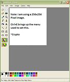](http://s20.photobucket.com/albums/b223/Plasmius/Paint%20Tutorial%201/?action=view¤t=pic1.jpg)I hate mouses. I really do. My opinion is that the easiest way to open paint is either to use Launchy, or to hit "Windows + R" and type in mspaint. These little shortcuts to not use mouses are second nature to me. Anyway, lets start with the difference between compression formats. Below is a breakdown of common formats -GIF - Small size, limited to 256 colors. Animation supported.PNG - Small size, color integrity maintained, a generally good workhorse compression format.BMP - Bitmap. No compression, largest file size, but offers the greatest level of robustness with colors. Tends to upload and download slowly.JPEG - Small size, shitty image quality. Makes images real small on a disk, but also fuzzes them up a lot. Never use them in Eclipse. Below is an example of a JPEG. See why it won't work well in Eclipse?Now then, what is the most useful tool in paint? Easy, the Zoom tool. First let's zoom into 600%[](http://s20.photobucket.com/albums/b223/Plasmius/Paint%20Tutorial%201/?action=view¤t=pic2.jpg)I'm going to draw a head. To do this, I am going to start with the Circle tool.[NOTE] Adjust your line weight by selecting the line tool. I will use the middle one.[](http://s20.photobucket.com/albums/b223/Plasmius/Paint%20Tutorial%201/?action=view¤t=Pic3.jpg)[TIP] SHIFT and CIRCLE make a perfect CIRCLE. SHIFT and RECTANGLE make a SQUARE[](http://s20.photobucket.com/albums/b223/Plasmius/Paint%20Tutorial%201/?action=view¤t=Pic4.jpg)Ahh, a perfect circle. Now, lets add some things to it. I'm going to use the LINE tool. The LINE tool is best used by making multiple short lines to make up a greater curve. This takes very little practice, and once you're good at it, you'll start to see the glory of paint.[TIP] I rely very heavy on the use of the UNDO command, CTRL+Z. Use it early and often.[](http://s20.photobucket.com/albums/b223/Plasmius/Paint%20Tutorial%201/?action=view¤t=Pic5.jpg) [](http://s20.photobucket.com/albums/b223/Plasmius/Paint%20Tutorial%201/?action=view¤t=Pic6.jpg)All of these nice attractive curved lines that I did were done with the line tool. I did them thick so that I can edit them easier later. This is all in 600% zoom. At 100%, it looks like this:[](http://s20.photobucket.com/albums/b223/Plasmius/Paint%20Tutorial%201/?action=view¤t=Pic7.jpg)One more thing to add. I'm going to use a thickness 1 line to add a frame that will tell us where to place features later. Don't be too hard on yourself when you place this, be flexible, but try to center it.[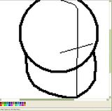](http://s20.photobucket.com/albums/b223/Plasmius/Paint%20Tutorial%201/?action=view¤t=Pic8.jpg)Now lets erase some unnecessary stuff.[](http://s20.photobucket.com/albums/b223/Plasmius/Paint%20Tutorial%201/?action=view¤t=Pic9.jpg)Simple, no? Let us continue. I'm not adding ears, because I intend to cover them with hair anyway. Let's add a line to tell us where to put this hair, and we'll add some guides for the eyes, nose and mouth.[](http://s20.photobucket.com/albums/b223/Plasmius/Paint%20Tutorial%201/?action=view¤t=Pic10.jpg)Now let's add some hair, and take away the lines that have served their purpose.[](http://s20.photobucket.com/albums/b223/Plasmius/Paint%20Tutorial%201/?action=view¤t=Pic11.jpg)I zoomed out to 400%, so it can be seen better. For all the hair, I used line weight 2, except near the scalp, I used line weight 1. Now I'm going to erase some more lines and add in the eyes.[](http://s20.photobucket.com/albums/b223/Plasmius/Paint%20Tutorial%201/?action=view¤t=Pic12.jpg)The picture is coming together. Next, the more advanced techniques, including Ghetto AntiAliasing (more useful than it sounds). Link to comment Share on other sites More sharing options...
Swordsower Posted December 31, 2009 Author Share Posted December 31, 2009 Now then, to make the picture look good. This here is what I have so far.[](http://s20.photobucket.com/albums/b223/Plasmius/Paint%20Tutorial%201/?action=view¤t=Pic12.jpg)Let's do some basic coloring. The fill tool is your friend, and this is what we end up with.[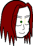](http://s20.photobucket.com/albums/b223/Plasmius/Paint%20Tutorial%201/?action=view¤t=Pic13.png) [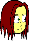](http://s20.photobucket.com/albums/b223/Plasmius/Paint%20Tutorial%201/?action=view¤t=Pic14.png)Notice that on the eyes, I created some boundaries in the color I'm going to start with for his skin. These boundaries were created with the pencil tool, and are useful when trying to fill the rest of the area. Skin is tricky, so I started with a color that is close. Now we get into custom colors.[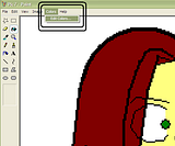](http://s20.photobucket.com/albums/b223/Plasmius/Paint%20Tutorial%201/?action=view¤t=Pic15.png) [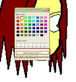](http://s20.photobucket.com/albums/b223/Plasmius/Paint%20Tutorial%201/?action=view¤t=Pic16.png) [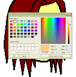](http://s20.photobucket.com/albums/b223/Plasmius/Paint%20Tutorial%201/?action=view¤t=Pic17.png)Getting the color just right can be tricky, but here's what I came up with for the first color I'm using for his skin. You can insert the numbers directly into the window, or you can use the EYEDROPPER to get a color from another picture, and transfer the numbers into a new window. Here is the new color in use.[](http://s20.photobucket.com/albums/b223/Plasmius/Paint%20Tutorial%201/?action=view¤t=Pic18.png)Now comes some shading. What we do is use the eyedropper to select the color we used in the first area to be shaded, and then lighten or darken it to taste before using the PENCIL and LINE tools to work the shading into the image. I'm going to lighten on the left, and darken on the right to simulate light. This is a very rough process, and is a 'tweak to taste' sort of procedure.[](http://s20.photobucket.com/albums/b223/Plasmius/Paint%20Tutorial%201/?action=view¤t=Pic19.png) [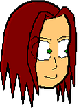](http://s20.photobucket.com/albums/b223/Plasmius/Paint%20Tutorial%201/?action=view¤t=Pic20.png) [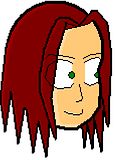](http://s20.photobucket.com/albums/b223/Plasmius/Paint%20Tutorial%201/?action=view¤t=Pic21.png)I lightened his skin tone a bit around the left sides of his features, and I gave him a bit of eye lining, and lined his lips to add depth to those features. This is just the lightening process. Now I will move on to the darkening process, which is largely the same.[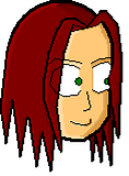](http://s20.photobucket.com/albums/b223/Plasmius/Paint%20Tutorial%201/?action=view¤t=Pic22.png)We're almost done with this image. The last step is to blend the lines. This is most easily accomplished in other software, such as Photoshop and the GIMP, which allow for selective lightening and darkening. This image is altogether done as is, and I reduced it to a decent size to demonstrate that starting and working on an image in multiple times scale results in a higher quality bit of pixel art.The finished product. Link to comment Share on other sites More sharing options...
ddunit Posted December 31, 2009 Share Posted December 31, 2009 I think you should check your first post, cause it's quite messed up. Link to comment Share on other sites More sharing options...
Swordsower Posted December 31, 2009 Author Share Posted December 31, 2009 Margins are duck'd? I'll fix it.Edit1: Alright, how is it now? Link to comment Share on other sites More sharing options...
Guest Posted January 2, 2010 Share Posted January 2, 2010 Cool this just might help me out. Link to comment Share on other sites More sharing options...
Minilinkki Posted January 2, 2010 Share Posted January 2, 2010 I don't need this.So why did i post then? Link to comment Share on other sites More sharing options...
Goku Posted January 2, 2010 Share Posted January 2, 2010 The picture looks to much paint. :D Link to comment Share on other sites More sharing options...
Swordsower Posted January 5, 2010 Author Share Posted January 5, 2010 @Cyrus:> The picture looks to much paint. :DYeah, I know what you mean, but one of the tricks is to use fat lines at x10 scale, and then reduce it to 10% size to simulate antialiasing and blend the lines and colors effectively. You have to sort of guess what line thickness to use, but 4 works well at x10 for a 32x64. Link to comment Share on other sites More sharing options...
ddunit Posted January 6, 2010 Share Posted January 6, 2010 Here's an alternative, but I'm pretty sure Crypto's got something it doesn't show. ;Dhttp://fay.iniminimo.com/paint_vista.html Link to comment Share on other sites More sharing options...
Capt. John Posted January 24, 2010 Share Posted January 24, 2010 Thanks,here's my first picture…[](http://img718.imageshack.us/i/gorillaphysko.png/)Looks like some Gorilla Human Physko thingy… Link to comment Share on other sites More sharing options...
Patrick Posted January 24, 2010 Share Posted January 24, 2010 Lol at cross eyes. Link to comment Share on other sites More sharing options...
Capt. John Posted January 24, 2010 Share Posted January 24, 2010 Yeah, I messed up the eyes a bit… Didn't notice that before you said anything now... lol Link to comment Share on other sites More sharing options...
Patrick Posted January 24, 2010 Share Posted January 24, 2010 You forgot shading? Link to comment Share on other sites More sharing options...
Capt. John Posted January 24, 2010 Share Posted January 24, 2010 What shading? There's suppose to be shading on a head? Gah! I dislike painting people…So hard, the one thing after another, it never get's done. Link to comment Share on other sites More sharing options...
Swordsower Posted January 25, 2010 Author Share Posted January 25, 2010 I lol'd so hard. Go into paint, hit CTRL+W, and if you did it in high res, you can % it down and it shades itself. Link to comment Share on other sites More sharing options...

Recommended Posts
Create an account or sign in to comment
You need to be a member in order to leave a comment
Create an account
Sign up for a new account in our community. It's easy!
Register a new accountSign in
Already have an account? Sign in here.
Sign In Now