Scythe Posted December 31, 2010 Author Share Posted December 31, 2010 I was just wanting to know what I could do better I only used 3 colors and I am VERY new to pixel art and im trying to improveIt is my basic hunter shoulder guard[](http://www.freemmorpgmaker.com/files/imagehost/#7ec8c89c83a2120f9db701d9678e5367.bmp)[](http://www.freemmorpgmaker.com/files/imagehost/#ced63b9b55c8d457be657575816a5dbf.bmp) Link to comment Share on other sites More sharing options...
Lukin Posted December 31, 2010 Share Posted December 31, 2010 Not sure what your sprite looks like, if I knew that it would probably be easier to say what could be improved. Link to comment Share on other sites More sharing options...
luriok Posted December 31, 2010 Share Posted December 31, 2010 Yes showing your character would help. Also BMP is not allowed on these forums. Link to comment Share on other sites More sharing options...
Scythe Posted December 31, 2010 Author Share Posted December 31, 2010 >! [](http://www.freemmorpgmaker.com/files/imagehost/#1d948f611c2099e7e9274c2a4be65a9c.bmp) Link to comment Share on other sites More sharing options...
aaaron Posted December 31, 2010 Share Posted December 31, 2010 Why are you using .bmp? Use .jpeg for your pictures. Link to comment Share on other sites More sharing options...
Scythe Posted December 31, 2010 Author Share Posted December 31, 2010 that is just how they have been saving sorry Link to comment Share on other sites More sharing options...
aaaron Posted December 31, 2010 Share Posted December 31, 2010 @Scythe:> that is just how they have been saving sorryWell I guess it it in the rules…So I was trying to help. Here is a tip, when you go to save it, it Save As under File and after the name you put, type -> .jpeg <-. (Without the -> <-) Link to comment Share on other sites More sharing options...
Scythe Posted December 31, 2010 Author Share Posted December 31, 2010 the screen shot does not give me that option i knew how to do it with the others but i did not know it was against the rules till it was too late Link to comment Share on other sites More sharing options...
aaaron Posted December 31, 2010 Share Posted December 31, 2010 " and the use of BMP may result in a warning, simply because it is not funny to use a huge image. "You can always pop the screenshot into paint and save as a jpeg. Link to comment Share on other sites More sharing options...
VitinhooxD Posted December 31, 2010 Share Posted December 31, 2010 @.Aaron.:> Why are you using .bmp? Use .jpeg for your pictures.Use .png . Please , unless its a high quality .jpeg . Link to comment Share on other sites More sharing options...
luriok Posted December 31, 2010 Share Posted December 31, 2010 @[Cake:> Woods â„¢ link=topic=67477.msg728080#msg728080 date=1293824770]> unless its a high quality .jpeg .Doubt it :P Link to comment Share on other sites More sharing options...
Scythe Posted December 31, 2010 Author Share Posted December 31, 2010 well will do from now on sorry…. but back to the topic does it suck? Link to comment Share on other sites More sharing options...
luriok Posted December 31, 2010 Share Posted December 31, 2010 Think it's fine, but is it suppose to be dull or shiny(more metal like)? If Shiny you might want to add another tone of red in there. That tone should be close to white but still have a tint of red in it. Link to comment Share on other sites More sharing options...
Scythe Posted December 31, 2010 Author Share Posted December 31, 2010 @Azyru:> Think it's fine, but is it suppose to be dull or shiny(more metal like)? If Shiny you might want to add another tone of red in there. That tone should be close to white but still have a tint of red in it.i was aiming for leather on this one they will be metal later on. does it look like leather? Link to comment Share on other sites More sharing options...
luriok Posted December 31, 2010 Share Posted December 31, 2010 I think you need to add one more darker red tone. Here is an example of what I mean:Open it in paint or whatever and zoom in, you will see it. Link to comment Share on other sites More sharing options...
Scythe Posted December 31, 2010 Author Share Posted December 31, 2010 is that all? and will do thanks :) Link to comment Share on other sites More sharing options...
SawQuart Posted December 31, 2010 Share Posted December 31, 2010 The colors need more variance. One color should be extremely light (for glare) and used minimally. The next should be used the most and should be a regular leather color. Then the next should be extremely dark (for the dark shadows).That only applies for 3 color palettes though, excluding the outlines which should be darker than the shadows, or even black. Link to comment Share on other sites More sharing options...
luriok Posted December 31, 2010 Share Posted December 31, 2010 Well it's suppose to be leather, and most leather is dull, so shine is need too much on this one. Link to comment Share on other sites More sharing options...
SawQuart Posted December 31, 2010 Share Posted December 31, 2010 Even leather shines.>! 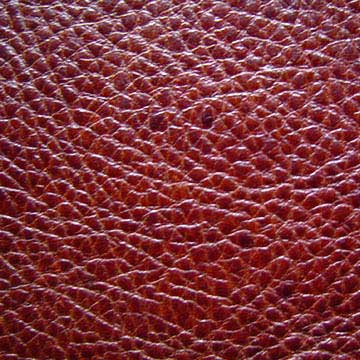 Link to comment Share on other sites More sharing options...
luriok Posted December 31, 2010 Share Posted December 31, 2010 @Azyru:> most leather Link to comment Share on other sites More sharing options...
SawQuart Posted December 31, 2010 Share Posted December 31, 2010 Well still, I think shine always adds a nice touch. Link to comment Share on other sites More sharing options...
Bret Posted December 31, 2010 Share Posted December 31, 2010 It doesn't fit with the sprite or the tiles. The color is too dark, and it looks really flat on the sprite. Try find a dark reddish pallet off another RM sprite to make it fit better. Link to comment Share on other sites More sharing options...
luriok Posted January 1, 2011 Share Posted January 1, 2011 @Bret:> It doesn't fit with the sprite or the tiles.True, but this is about the item not the rest. Link to comment Share on other sites More sharing options...
Anna Comnena Posted January 1, 2011 Share Posted January 1, 2011 The coloring is too dark and it's too flat, even with the little shine you have. Size and shape it looks good, however, but I think it doesn't look right on the sprite because it doesn't have the same color style as the sprites do (too dark and solid, not enough contrast between the inner fill and the outline). Link to comment Share on other sites More sharing options...
Scythe Posted January 2, 2011 Author Share Posted January 2, 2011 im not good at color theory i cant tell where to put color and where not to im trying to get my sis to help as she is an artist(unofficial) but she does not want to Link to comment Share on other sites More sharing options...

Recommended Posts
Create an account or sign in to comment
You need to be a member in order to leave a comment
Create an account
Sign up for a new account in our community. It's easy!
Register a new accountSign in
Already have an account? Sign in here.
Sign In Now