Irhymer Posted April 14, 2012 Author Share Posted April 14, 2012 For the past week, I picked back up on a pixel art style I started making months ago. I'll be sharing what I've done here for the un-named project that I'm personally working on.More Coming Soon ;)-Jake Link to comment Share on other sites More sharing options...
Helpmeplz Posted April 14, 2012 Share Posted April 14, 2012 Transitions for the tile set please lol. Link to comment Share on other sites More sharing options...
Irhymer Posted April 14, 2012 Author Share Posted April 14, 2012 @LegendWeaver:> Transitions for the tile set please lol.I purposely didn't use transitions for the style I'm going for lol–-Chest:Doors:Random Placement (Test):Next Houses? Link to comment Share on other sites More sharing options...
Fuu Posted April 14, 2012 Share Posted April 14, 2012 @-Jake-:> I purposely didn't use transitions for the style I'm going for lollolwut Link to comment Share on other sites More sharing options...
SawQuart Posted April 14, 2012 Share Posted April 14, 2012 I like the style. Try making the water lighter to contrast the grass more. Link to comment Share on other sites More sharing options...
Irhymer Posted April 14, 2012 Author Share Posted April 14, 2012 @Fuu:> lolwutWhat don't you understand? I want the tiles to look square and straight cut.. ex.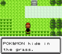@Jungle:> I like the style. Try making the water lighter to contrast the grass more.Thanks, I'll try that out. Link to comment Share on other sites More sharing options...
Medleyy Posted April 14, 2012 Share Posted April 14, 2012 No transitions just look… bad.Try them, at least. Maybe just a wavy line would improve it without ruining the simplicity? Link to comment Share on other sites More sharing options...
Fuu Posted April 14, 2012 Share Posted April 14, 2012 @-Jake-:> What don't you understand?I understand, I just don't agree with it.Don't try and use that picture as an example. You know damn well the water and grass on Pokemon have a cliff for a transition. Link to comment Share on other sites More sharing options...
SawQuart Posted April 14, 2012 Share Posted April 14, 2012 @Aeri:> No transitions just look… bad.Jesus guys, he's trying to go for a retro look. Plenty of games didn't use transitions back in the retro era. Get off his case. Link to comment Share on other sites More sharing options...
Fuu Posted April 14, 2012 Share Posted April 14, 2012 @Jungle:> Jesus guys, he's trying to go for a retro look. Plenty of games didn't use transitions back in the retro era. Get off his case.Stop trying to back up incorrect things.I've never seen grass right next to water, unless there was a cliff involved. Link to comment Share on other sites More sharing options...
Baron Posted April 14, 2012 Share Posted April 14, 2012 transitions are fairly crucial to any tileset. Even square looking games have transitions. without transitions you have something harking back to ye days of old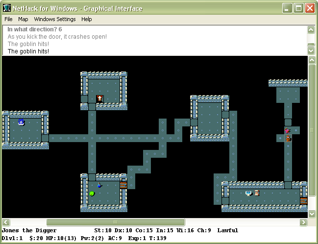 Link to comment Share on other sites More sharing options...
Irhymer Posted April 14, 2012 Author Share Posted April 14, 2012 Ok, calm down guys lolI tried this, what do you guys think? Link to comment Share on other sites More sharing options...
Medleyy Posted April 14, 2012 Share Posted April 14, 2012 Much nicer! It looked a little lazy before, now it looks good. Not too over the top, but not too simple. Link to comment Share on other sites More sharing options...
Baron Posted April 14, 2012 Share Posted April 14, 2012 @-Jake-:> Ok, calm down guys lol> > I tried this, what do you guys think?> thats a ton better. I agree with Aeri's comment. it looked a bit lazy before, but that change seems to fix it right up. Link to comment Share on other sites More sharing options...
Irhymer Posted April 14, 2012 Author Share Posted April 14, 2012 @Aeri:> Much nicer! It looked a little lazy before, now it looks good. Not too over the top, but not too simple.@Baron:> thats a ton better. I agree with Aeri's comment. it looked a bit lazy before, but that change seems to fix it right up.Thanks, feel much better now! Onto the houses I suppose. :cheesy: Link to comment Share on other sites More sharing options...
DarkRevenge Posted April 15, 2012 Share Posted April 15, 2012 look good now that its fixed Link to comment Share on other sites More sharing options...
Octohunter Posted April 15, 2012 Share Posted April 15, 2012 I love it, but that may be my huge bias towards all things retro speaking. Link to comment Share on other sites More sharing options...
saadhamza Posted April 15, 2012 Share Posted April 15, 2012 That looks quite awesome, and that's coming from someone that's not always the biggest fan of retro. Keep it up Link to comment Share on other sites More sharing options...
Irhymer Posted April 16, 2012 Author Share Posted April 16, 2012 Thanks you all, here's the character base fully animated: Link to comment Share on other sites More sharing options...
Drummerpete Posted April 16, 2012 Share Posted April 16, 2012 I think the grass needs to be spread out a bit to look even. It looks like cubey clumps. Link to comment Share on other sites More sharing options...
Jeff Posted April 16, 2012 Share Posted April 16, 2012 Grass tiles badly and your wood grain textures need work. Personally I don't like the dark blue swirls in your water either, I think it would look better and simpler if they were all light blue.The grass clearly tiles and every one of them is the same with slightly different colors. Make grass tiles where the tufts are actually in different places and it will look better.Best of luck and looks good. Link to comment Share on other sites More sharing options...
Zappy Posted May 10, 2012 Share Posted May 10, 2012 It's really awesome. It feels right, smooth, simple, retro, all that great stuff.My only advice is less contrast. Only for the base terrain tiles such as water, grass. Trees, doors, chests, sprites should stay the way they are. If you don't agree with me, just try it and see. If you lowered the contrast with the grass palette, water palette, so forth, I'm sure it'd be easier on the eyes, and even more pleasing than it is now ~! Link to comment Share on other sites More sharing options...
Dark Crusade Posted May 10, 2012 Share Posted May 10, 2012 Please don't use transitions. Your originals looked better, and I understand and favour the style. Link to comment Share on other sites More sharing options...
Chief Posted May 10, 2012 Share Posted May 10, 2012 I think what you need instead is a tile to use as a transition, like a sand for beach, or dirt. It just looks odd going from real grassy to water. Otherwise I agree, the transitions look much more odd then having none. Link to comment Share on other sites More sharing options...
Dark Crusade Posted May 10, 2012 Share Posted May 10, 2012 Here some screenshots from a title which had few to no transitions.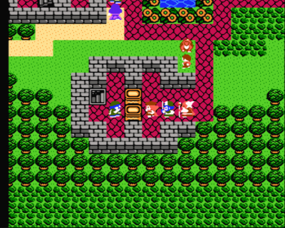 Link to comment Share on other sites More sharing options...

Recommended Posts
Create an account or sign in to comment
You need to be a member in order to leave a comment
Create an account
Sign up for a new account in our community. It's easy!
Register a new accountSign in
Already have an account? Sign in here.
Sign In Now