Master LoLo Posted December 9, 2010 Author Share Posted December 9, 2010 i want to know what people think so far cause i do know there are little things that need to be fixed. Link to comment Share on other sites More sharing options...
Jeff Posted December 9, 2010 Share Posted December 9, 2010 sheeesh, you read a mapping tutorial!!! ur better than most newbs, but use transitions from grass to snow. Link to comment Share on other sites More sharing options...
Robin Posted December 9, 2010 Share Posted December 9, 2010 Those cliffs look silly. Sort out the shape and height. You don't have a cliff growing 50 feet out of the floor with a shiny edge. What you have on the left is what you should do to build the cliff up. Have different layers. Use the masked cliff bottom instead of just having a clean cut, however. Link to comment Share on other sites More sharing options...
Master LoLo Posted December 9, 2010 Author Share Posted December 9, 2010 ok i am going to work on it a bit more and come back in an hour with a new pic to see what you guys think Link to comment Share on other sites More sharing options...
Master LoLo Posted December 9, 2010 Author Share Posted December 9, 2010 @Jeff:> sheeesh, you read a mapping tutorial!!! ur better than most newbs, but use transitions from grass to snow.i am useing the basic EE2.7 tile set if i can find them i will use them Link to comment Share on other sites More sharing options...
Anna Comnena Posted December 9, 2010 Share Posted December 9, 2010 Visually it isn't that bad, except for the lack of transition with the grass and snow. Also the cliffs are not consistant in their heights, which seems to be a common problem with mapping. Here's a few general guidelines:@Anna:> **Avoid overuse of straight lines.** Nature isn't a bunch of straight lines: between the many forces of erosion (wind, water, gravity), many nooks, cranniess, gullies, and canyons will be carved out of a mountain. Also not only does a straight block for a mountain look unnatural, it also looks repetitive.> > **Limit repetitive tiles.** This is the main thing about tileset mapping, is you are making a map of often the same tile. So you need to avoid repetition as much as you can, especially with cliff faces. This can often be avoided by making the cliff curve inward and outward often, related to the first tip.> > **Terrace your hills and mountains instead of having a high cliff.** This is essentially tip one, but used vertically. Often people will make their mountains a big block of a high cliff, which ends up looking too straight, and also looks repetitive. The thing is, RMXP tilesets come with a great pre-set height that is easy to place on your map:> [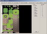](http://img.photobucket.com/albums/v400/annacomnena/gfx/map%20tutorials/mt-cliffsize.jpg)> > **Vary the amount of trees and foliage** Don't use the exact same tree and bush all over the place, have atleast a couple vari.ations of them. Again, this helps repetition, the primary enemy that mappers of tileset style maps should avoid. In the same light, however, you don't want to have to much difference, as often in one area the foliage will be the same. For example planting a bunch of bright tropical flowers in a dark mountain forest doesn't look right, nor would mushrooms growing in the middle of a desert flat.Also, from a gameplay design point, that map looks like it will be horrible to navigate as a player; especially if any NPCs are added, or other players are there. Remember your gameworld has to look good, but it also has to be designed to allow the most optimal movement for players and entities.:) Link to comment Share on other sites More sharing options...
Robin Posted December 9, 2010 Share Posted December 9, 2010 @Master:> I am useing the basic EE2.7 tile set if I can find them I will use themUse Origins. Much easier to create good areas with dynamic map sizes. Link to comment Share on other sites More sharing options...
Anna Comnena Posted December 9, 2010 Share Posted December 9, 2010 @Robin:> @Master:> > > I am useing the basic EE2.7 tile set if I can find them I will use them> > Use Origins. Much easier to create good areas with dynamic map sizes.You're such a slut sometimes. ;D Link to comment Share on other sites More sharing options...
Robin Posted December 9, 2010 Share Posted December 9, 2010 Using Evolution is just stupid. It's bugged up and it was deprecated for over a year ago now. We're zoning out support for it. Origins is the new standard. Link to comment Share on other sites More sharing options...
Anna Comnena Posted December 9, 2010 Share Posted December 9, 2010 I know I just felt like spamming. Link to comment Share on other sites More sharing options...
Robin Posted December 9, 2010 Share Posted December 9, 2010 @Anna:> I know I just felt like spamming. Link to comment Share on other sites More sharing options...
Master LoLo Posted December 9, 2010 Author Share Posted December 9, 2010 @Robin:> Use Origins. Much easier to create good areas with dynamic map sizes.i would use Origins if i knew where to get it because its not on the main site by what i saw any way.and here is my revised version Link to comment Share on other sites More sharing options...
Robin Posted December 9, 2010 Share Posted December 9, 2010 The main site is horrible outdated.[http://www.touchofdeathforums.com/smf/index.php/topic,57637.0.html](http://www.touchofdeathforums.com/smf/index.php/topic,57637.0.html)As for your map, delete everything and start again. Link to comment Share on other sites More sharing options...
Master LoLo Posted December 9, 2010 Author Share Posted December 9, 2010 @Robin:> As for your map, delete everything and start again.to tell the truth i have done better. it has just been like a year since i made maps. Link to comment Share on other sites More sharing options...
Robin Posted December 9, 2010 Share Posted December 9, 2010 It wasn't meant as an insult. I'm simply saying that you won't improve by simply editing your bad maps. If something doesn't work out, delete it and start again.It's the exact same as drawing. You won't be able to make every map work. If it didn't work, simply learn from the mistakes and start again. Link to comment Share on other sites More sharing options...
Absolute Posted December 9, 2010 Share Posted December 9, 2010 Actually, Its not like drawing. When you draw and it doesn't work out, you use your mistake to make a new meaning to it.Anna Comnena is right. The map isn't very friendly if theres a whole bunch of npcs there and your trying to get by. Link to comment Share on other sites More sharing options...
Robin Posted December 9, 2010 Share Posted December 9, 2010 @Absolute:> Actually, Its not like drawing. When you draw and it doesn't work out, you use your mistake to make a new meaning to it. Link to comment Share on other sites More sharing options...
luriok Posted December 9, 2010 Share Posted December 9, 2010 the second is better than the first, but I would suggest starting over. It'll give you a fresh start. Link to comment Share on other sites More sharing options...
Master LoLo Posted December 10, 2010 Author Share Posted December 10, 2010 @Azyru:> the second is better than the first, but I would suggest starting over. It'll give you a fresh start.yes this i know and also i don't know about orgins and thats the one i am going to be working on atm i just need to increase the map size to say 20 x 20 if possible along with the screen of the game. Link to comment Share on other sites More sharing options...
Robin Posted December 10, 2010 Share Posted December 10, 2010 If you're using Origins simply go to the map properties. You can set each map to any size up to 255x255 individually. Link to comment Share on other sites More sharing options...

Recommended Posts
Create an account or sign in to comment
You need to be a member in order to leave a comment
Create an account
Sign up for a new account in our community. It's easy!
Register a new accountSign in
Already have an account? Sign in here.
Sign In Now