

cloudsky
-
Posts
64 -
Joined
-
Last visited
Never
Content Type
Profiles
Forums
Calendar
Everything posted by cloudsky
-
Looks really good! One word "Beautiful!
-
I actually like the idea. It's cute and unique (well atleast for an Eclipse game).
-
I really like the graphics. They're pleasing to the eyes. The trunk is too detailed with the rest of the graphics, but it actually looks good and I like the idea of a huge tree among the other trees. Really good job on the graphics! 
-
The trunk and roots doesn't look like trunks and roots (or atleast in my point of view). Lessen the puffiness of the tress, they look like candies. The cliff is a little to detailed than the rest of the tiles. I love simplistic and minimalist style. Keep up the good work and best of luck for you. Excited to see what the rest of the tiles would look like. :)
-
*Clicked the thread and said "wow!". For me the thing I really didn't like in particular is the well, it looks off. Most points I want to say have already have been covered above, so GOOD LUCK!
-
With all honesty, I prefer the old one better. Mainly because of the map shape ; this weird shape turns me off. But undeniably, this one is still good. Nice work! :)
-
The map looks pretty decent, but make some of the pathways and doors a little wider (let say two or three tiles) too avoid being stuck up (unless you will implement walk through player and NPC). It is missing (or over) with a thing or two, but with a minor retouch I think this map will look really good. The torch thing on the second and third map should be lowered by a tile (or raising the wall by one tile), since it doesn't look good if the flame is higher than the wall. I suggest that you connect this two parts using a lava since caves usually have more than one path but some are blocked with an obstacle or two. It adds a "it's connected" feel. ._.
-
Some of the tiles look wow, while some look fine, and some are bleh.. :) I don't mind the bright colours, I like it that way. Make the wall bricks compact ; lessen the borders of the tiles and floor bricks, make them flat and blend them with other tiles to avoid making them look like side-scroller platforms ; the flow of water downstream doesn't fit too well. There are some mistakes and so on and so forth, but good work! Thumbs up! :)
-
I kinda like the simplistic and very minimalist style, however they don't appeal much. It is also a little hard to distinguish things. If ever you go with this style, then the sprites need to be in the same or at least similar style. I wonder what the sprites will look like. :)
-
Lovely! I love the simplicity! I would love to see a lake as well. ._.
-
I no longer want to compare the old and new graphics, that is why I said I had got over it. (No matter what you say they won't listen. Remember the time this topic got locked?) But atleast now their (Jump Button Studios) responds are more professional. Regarding the name, I actually prefer the name Psithyroi. I am just asking why they changed it again since I never heard the reason why they changed it in the first place to Mystic Tale.
-
I also prefer the old ones, but I already got over with this topic xD Why it came back to Psithyroi? I thought the game's name will be mystic tale? I would like to ask how much progress you have made? (In terms of engine and graphics)
-
The problem with your work is that you focused on elegance and forgot about readability and simplicity. Both images has too much light effect or is too bright (which hurt my eyes). Try to make sure that the images are readable.
-
The mapping looks so unplanned. The space is not maximized nor used well ; use the space. The items are not properly positioned/placed as well. Use variety ; imagine that you are the person there (where would you place things? Just randomly or all items on the side?, No). ; Use walls or rooms (or dividers or borders) to organize the space. :)
-
Kinda creeps me out! Really nice and for some reason I find it intriguing. The music itself is like talking and sharing a story. Nice work! :) I do agree that it's over all odd for some reason. And for some reason the first 16 seconds reminds me of Harry Potter…
-
Noted: Too bright, bad color palette, too flat, too childish. @Toshiro: > Reminds me of Retarded Online. xD There's two big difference between Retarded online with my graphics, one that is positive to my side and one that is negative. The positive side is, the graphics above look better than Retarded online's graphics without having a second though. The negative side there is Retarded online achieved it's goal for it's graphics to look ~~bad~~ horrible, where in my goal is too make it pleasant, which obviously I didn't reached. Admiral Refuge: Well, I don't want to play a game with only two players XD. Jungle: It's a toy shop, that part is a play ground thing for kids. I tried to put details and give depth to the graphics last night, but they didn't look any better, instead worse. I will update this post once I have updated the graphics (hopefully they will look better and no longer flat). Thank you all for your inputs. :cheesy:
-
 The title says it all. I kept it as simplistic as possible.
-
I really don't like 16x16 games in particular, but due to pixelling quality I will probably play this when it comes out. Well, I'll be honest, the graphics are not the best but they are in good quality (and I know they will get better). I like the fact you were able to squeeze in different details, texture, and proper shading despite the graphics size. Looking forward to see this game in action. :)
-
Quick! Admins are asleep! Count as high as possible!
cloudsky replied to emblem's topic in Forum Games
1\. One. Uno. -
Yes, it is indeed possible. However you need to code it for yourself, as there is no exact tutorial for that, but here is the list of tutorials that will help you and serve as your base. [Locked Classes System](http://www.touchofdeathforums.com/smf/index.php/topic,70427.0.html) –-> Locks classes from the beginning (character creation process). [You can modify this one to change the classes of your current character](http://www.touchofdeathforums.com/smf/index.php/topic,68828.0.html) –-> NOTE: this changes the sprite of your character, you need to modify it to change your class instead.
-
Never…
-
Quick! Admins are asleep! Count as high as possible!
cloudsky replied to emblem's topic in Forum Games
To. Too. TWO -
Nah, this is much better 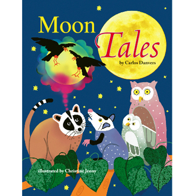
-
Juvanio: Thank you for your help! :D @Lumiere: > Here try this,no need to thank me i hope you like it,because it took me 5 hours to finish it ;) > >  Lumiere: hahaha, lol! I wish you made the text colour blue, not violet XD If you are implying why I din't tried to make one myself, here's my answer. I am a Graphics artist(on training) myself, but I am lacking of ideas at the moment. And besides, there is no harm in asking better DG artist to make a logo for you, unless you ask for a new logo everyday XD.
-
Hello there, I would like to ask a little help, I need a logo for my game, details below. Name: Moon Tales (upper part), Luna's Whisper (lower part, smaller text) Color: Greyish Yellow, Silver, Grey, blue-grey Text Style: What fits most Back(Optional): A moon (either full moon or half), night clouds Thank you in advance! If you need anything else don't hesitate to pm or post here.