vrage Posted April 7, 2009 Author Share Posted April 7, 2009 This is for a new thing that'll you'll all hear about soon enough: Link to comment Share on other sites More sharing options...
edache Posted April 7, 2009 Share Posted April 7, 2009 Its simple and stylish, Nice one Rage!I like the blue thing on the background. Link to comment Share on other sites More sharing options...
xeross Posted April 7, 2009 Share Posted April 7, 2009 I like it.Would be cool if you removed the black on your forum signature so the forum background shines through. like Edache's Sig.Regards, Xeross Link to comment Share on other sites More sharing options...
vrage Posted April 8, 2009 Author Share Posted April 8, 2009 @Xeross:> I like it.> Would be cool if you removed the black on your forum signature so the forum background shines through. like Edache's Sig.> > Regards, Xerossaye aye Link to comment Share on other sites More sharing options...
Chief Posted April 11, 2009 Share Posted April 11, 2009 and, for tose who are wanting to learn how to make this,http://www.webdesign.org/web/photoshop/text-effects/how-to-create-killer-metallic-text.17048.html Link to comment Share on other sites More sharing options...
vrage Posted April 11, 2009 Author Share Posted April 11, 2009 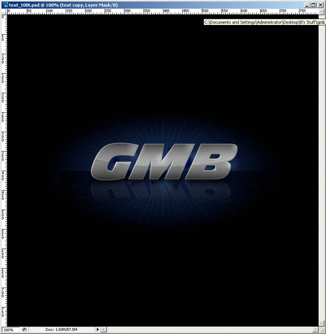I see you cant judge styles.**The background is a standard brush** pal. ;) Link to comment Share on other sites More sharing options...
xeross Posted April 11, 2009 Share Posted April 11, 2009 I like theirs better.Nah, just joking.It seems you took that tutorial but modified it a bit.Regards, Xeross Link to comment Share on other sites More sharing options...
Chief Posted April 11, 2009 Share Posted April 11, 2009 Yes, VRage, i understand its different. but it shows that you atleast gathered ideas from it. Link to comment Share on other sites More sharing options...
xeross Posted April 11, 2009 Share Posted April 11, 2009 Since when is it wrong to do that.I sometimes base my designs on websites/gui's posted hereRegards, Xeross Link to comment Share on other sites More sharing options...
Drummerpete Posted April 11, 2009 Share Posted April 11, 2009 I agree; modifying existing ideas is fine, some people find it incredibly hard to fabricate things from nothing. Link to comment Share on other sites More sharing options...
Adulese Games Posted April 11, 2009 Share Posted April 11, 2009 I agree with Xeross. There is nothing wrong with it. I suggest making it a transparent PNG though for the forums.- Adulese Link to comment Share on other sites More sharing options...
xeross Posted April 11, 2009 Share Posted April 11, 2009 I wish i could advertise my company here, but i don't want the name xeross linked to the company.If they google it and they find an account on multiple forums including this one.I don't think they'll contact me if they see a grammar Nazi flag.@V-Rage: Make it transparent for the forums that would look a lot better.Regards, Xeross Link to comment Share on other sites More sharing options...
Chief Posted April 11, 2009 Share Posted April 11, 2009 lol, did I say its wrong? i dont thinkso… umm, what? nvm... Link to comment Share on other sites More sharing options...

Recommended Posts
Create an account or sign in to comment
You need to be a member in order to leave a comment
Create an account
Sign up for a new account in our community. It's easy!
Register a new accountSign in
Already have an account? Sign in here.
Sign In Now