Jeff Posted June 4, 2011 Author Share Posted June 4, 2011 Hey, I'm working on Moonvale's GUI and am in need of some critique. Here I will be posting many updates, but just a couple things for now.It's supposed to be sort of earthy and old, but also retro. I'm really having trouble on the retro part. How do I make something feel retro other than just doubling its size? I've already reduced the color count some, but perhaps it needs to be reduced more.Next, a bar.Same questions Apply here.Thanks! Link to comment Share on other sites More sharing options...
Robin Posted June 4, 2011 Share Posted June 4, 2011 Looks like you threw up on it. Link to comment Share on other sites More sharing options...
Jeff Posted June 4, 2011 Author Share Posted June 4, 2011 @Robin:> Looks like you threw up on it.Now I cannot see it any other way D: anyone have suggestions on how to make it look more like plants? I'll try and throw together some vines on it now…edit--decided to scrap the plants idea. I threw together a wooden button:–edit 2made bar without fungus, and made it a little better imo... not sure if the two styles quite match though. Link to comment Share on other sites More sharing options...
Robin Posted June 4, 2011 Share Posted June 4, 2011 Stop using the EO style GUI elements. It really doesn't work. Link to comment Share on other sites More sharing options...
IdoFreePixel Posted June 4, 2011 Share Posted June 4, 2011 Here, I made you a quick one. Link to comment Share on other sites More sharing options...
Conra Posted June 4, 2011 Share Posted June 4, 2011 Nice font you have there IdoFreePixel. What's it's name?Anyway I am back Frosty.Regards,Conra Link to comment Share on other sites More sharing options...
Jeff Posted June 4, 2011 Author Share Posted June 4, 2011 So, Robin you're suggesting I should change the size and make it differently shaped? or what? Maybe change the font? To be honest, I chose Georgia because it was legible when small and it looked fairly elegant. What font would you suggest? I'm thinking about Constantia right now, perhaps verdana.@IdoFreePixel:> Here, I made you a quick one.> wow, that looks really nice… looks like you used a bevel on the border, kept the border a complete rectangle, outlined the border in black, made gold text then beveled the gold text then outlined it in dark color. However, may I ask where you got the wood texture from? or did you just make a bunch of vertical lines? Link to comment Share on other sites More sharing options...
Jeff Posted June 5, 2011 Author Share Posted June 5, 2011 @Xlithan:> "I think the colours could work better if they were X and Y, and the pattern could be changed by adjusting 'this' and 'that'" is a lot better than "Looks like you threw up on it."> > If that's critisism, then i'm black.no, it is criticism. Its useful. I never even saw it to be looking like barf. If it weren't for him, I would've probably made a GUI completely based around plants that looks like barf.Now can you and robin stop ranting on in this thread? The rantings lost its relevancy a while ago.@Robin:> Just make a texture overlay and set it at about 10% colour burn.Meh, I just made a layer of brown noise and used a motion blur to make up and down lines@Devo:> El Frosteo, don't listen to the haters, keep practising. People who put you down generally can't do better themselves, and from the people I've just read comments from in this thread, thats a pretty accurate statement on my part.> > No, your buttons are not fantastic but could be with a little work, and especially with constructive criticism rather than rantings. It seems like you are starting to get the hang of working with layers, try adding style effects to those layers now and layer effects.thanks. What do you mean by layer effects though? like embosses and bevels? or like the layer effects in photoshop? I don't have access to photoshop that much.Anyways, I threw together a couple of buttons inspired by Idofreepixel's.Personally I like the second one better, but I think both of there borders are a bit too bright. The problem is I don't know how to do Gold looking borders without having them this bright. Link to comment Share on other sites More sharing options...
Helpmeplz Posted June 5, 2011 Share Posted June 5, 2011 That gold doesn't really go well with the wood. (Opps just realized you said this). You should make it less of the bright yellow because gold isn't really that yellow in real life it's more of this color>! 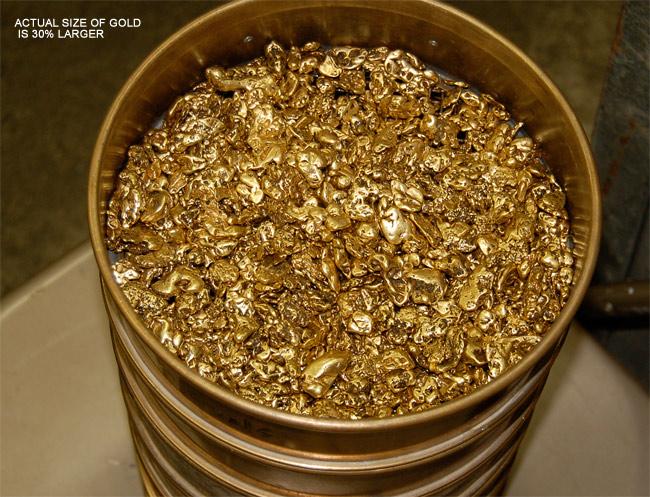 So try to change the color.I made a quick example: Link to comment Share on other sites More sharing options...
Jeff Posted June 5, 2011 Author Share Posted June 5, 2011 Thanks Legend, That really helped. I also added that drop shadow under the border like you did and changed the color of the wood to better match the color of the border and text.–editspent a couple more seconds on it and I think I improved it a bit.added drop shadow under the text and made the border less bright. Link to comment Share on other sites More sharing options...

Recommended Posts
Create an account or sign in to comment
You need to be a member in order to leave a comment
Create an account
Sign up for a new account in our community. It's easy!
Register a new accountSign in
Already have an account? Sign in here.
Sign In Now