

Falnax
-
Posts
91 -
Joined
-
Last visited
Never
Content Type
Profiles
Forums
Calendar
Everything posted by Falnax
-
@Ninja-Tech: > but if i told you you would be rly lost So…your story is written to be nearly impossible to understand, and even more difficult for a player to pick up at the beginning? Brilliant.
-
@ÃÂřãÄÂÃ…Âņ: > All the work he had to do really was getting the font :P Not true. Vivaldi is a default font on most XP running PCs. EDIT: Had that somewhat wrong. Looks like it's not always default, although it most certainly is installed by Photoshop installation.
-
Well, my main complaint is that it looks like you just took the maple leaf brush and clicked a few times. There's not really any suspension of disbelief here at all, which is easy to find in the works of many artists on this forum.
-
@Ninja-Tech: > mhm there is a hugge ass part bout it lol Not that I'm arguing with you at all, I fully support the idea, though I'd be able to visualize it better if you could tell us that story point specifically…
-
@Ninja-Tech: > true i kno its part of the story thats why Just making sure it's an important point that you're willing to defend in the face of adversity, and not just the failure to design clothes for the characters…
-
My main question is why unclothed paperdoll templates appear in the logo section…I understand that there might be some sort of artistic rationale to it all, but it's still a choice that would be difficult to explain tastefully to younger players.
-
Hopefully, I'm the only one around here who's had this happen to me in real life…
-
Can I please note that pheXion's native language is not, in fact, English? Because this whole argument looks more like an error in communication than an actual problem with each other's ideas.
-
@Anna: > But anyway, I prefer the simulated "ink on paper" drawn style of map, like I did for Seven Nations: Right, I had mentioned that I wasn't too into the idea of textured representation, which seems to be generally what people in the independent game industry use…I usually like to make my maps look like they've been drawn on paper, as you demonstrated. Not to mention that I try to come up with more random shapes than seen here; I wanted to completely reshape the western continent, but was worried about how that might affect his game design. I'll definitely see what I can do about more delicate political boundaries, though...wasn't really taking them too seriously this time. Just a random note, though...Shadowwulf, you mentioned that the continent shapes you used were just random ideas, which seems to conflict with the fact that the title is "Actual Map for the continents."
-
@MrMiguuâ„¢: > The one thing it doesn't have is a well blended transition between the actual land and the sea, If that was better it might not taste so good. Um…I honestly can't comprehend the meaning of that phrase...I don't really see how an improvement would make it taste worse. But, I'll agree that the disagreement between the appearance of the land and that of the sea was my biggest disappointment coming out of this map. May put in a little more work to fix that, if Shadowwulf asks for it. EDIT: Seems like I missed a few things, here and there...what I had thought was one reply was actually four. Also, in response to the southeast continent thing, I thought it was a cardinal. Northeast looks like an arm making a thumbs-up...
-
@Peter: > maybe if you could give me an example of what u think a fun game would be i could work off of that. I would love it if I could, but that is quite a difficult question, if only because it's so open-ended…and, more importantly, I highly doubt that you would be interested in devoting hours of your life to developing my dream. Really, you'll probably have to do a bit of research on that yourself...have you played many MMOs? Because the more MMOs you play, the more comprehensive your view of the field will become. That way, at least if you can't come up with an original idea, you can combine enough different ideas to make something that seems unique.
-
Most importantly, try to be as original as you can with this project…you can't very well use anime graphics done by other people as your GUI. Also, though it is possible for your concept to work out, you'll have to find some brilliant way to differentiate yourself from World of Warcraft, or else it won't get too many players - after all, they can just go over there to get exactly the same concept with better graphics and a larger community.
-
@Simius: > I see a hamburger in the leftmost continent. I love the way that my editing has done very little to discourage the idea that it is, in fact, a hamburger.
-
Using my usual technique, which is to photograph things and process those into textures…which is a complex and rarely the same set of sampling, color adjusting, scrambling, and such until it looks sufficiently arbitrary. Grasslands and mountains were both patterns I made a while back, forest was a new one for this map, but I've definitely had others turn out better. Mountain also had some low-opacity beveling in order to give it the "shape." Ocean texture was actually just the original, but at a different scale with some color tweaks. Generally, when texturing things, you want to have diversity in the textures. Because you used the same texture on every surface for the original map, it became much weaker, say, when done in black and white (Which would be a dealbreaker if you want to publish it in a book). The pattern diversity of the edit allows it to carry equal information whether the colors are present or not. By the way, if you're looking for anything else, like minor changes, labels, stuff like that, I'd be happy to do them for you. Just make sure to give me credit, that's all I ask.
-
Well, as a long time follower of the whole Crystal Genesis project, I decided to take a stab at the map…I rarely do my maps as textural representation, but thought it seemed like an interesting project, anyways. Obviously, it's the same map you posted, but with slightly redrawn borders and textures. Check it out. Tiny version is preview only, real map is the link below it: 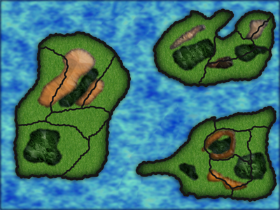 http://i357.photobucket.com/albums/oo14/Amperglyph/Reindex.png
-
I support the cash shop idea, just remember to make sure that items that can be obtained without the use of the Cash Shop should look good, too. It was a problem with LaTale, where the ingame purchasable armor was somewhat garish, visually. The point is, being able to like what you look like online should be a basic right, not something solely for paying customers. My point is, don't neglect your non-Cash Shop items.