beckymegan Posted July 15, 2011 Author Share Posted July 15, 2011 Hey everyone!So I just finished my first ever, custom GUI. I'm working on the "main' in game part right now but here are some pictures of the menu/splash screen. Any comments welcome and all taken into consideration :)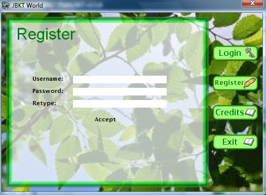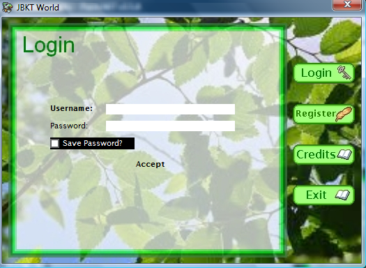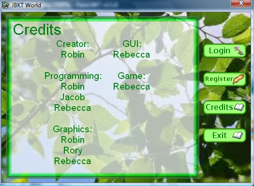 Link to comment Share on other sites More sharing options...
Robin Posted July 15, 2011 Share Posted July 15, 2011 Go look at some real GUIs for some inspiration. Link to comment Share on other sites More sharing options...
shadowdeath Posted July 15, 2011 Share Posted July 15, 2011 At least give him some C&C.1\. Too much green and white, I'd add in some more contrast2\. Way too light. I'd darken it a bit.3\. The Background looks awkward against the actual GUI.4\. Buttons look good, but Font's a bit uneven.5\. The black on top of the transparent box dosen't look that good.6\. The transparent part is fancy, but dosen't match the style. It messes it up a bit style wise. Link to comment Share on other sites More sharing options...
Helpmeplz Posted July 15, 2011 Share Posted July 15, 2011 Actually go do what Robin said then start a new one. Link to comment Share on other sites More sharing options...
Jeff Posted July 16, 2011 Share Posted July 16, 2011 yeah, scratch this. For buttons at your level I suggest you take a look here: http://developersunite.byethost13.com/showthread.php?tid=153Don't make anything transparent unless the transparency serves a stylistic or mechanical purpose. Making a transparent white box just looks ugly. Instead make it opaque. For borders I'd say make them mostly 1-3 pixels, of different innerborder/outerborder colors. Your background image is pretty bad quality, I suggest you get a higher resolution/crisper one. Link to comment Share on other sites More sharing options...
eltony Posted July 16, 2011 Share Posted July 16, 2011 Lol its looks cute hehe try adding some detail to the borders like some smooth edges and try changing the background image with something with a good rez Try adding an anime style leafs it might look better and dont forget to add some detail. :) Link to comment Share on other sites More sharing options...
Robin Posted July 16, 2011 Share Posted July 16, 2011 @shadowdeath:> At least give him some C&C.I did. This doesn't look like a GUI. Why should I have to explain to someone what a GUI is?As I said, go look at some real GUIs and emulate them. Start again. This doesn't look like a GUI, it looks like something made in Photoshop. Link to comment Share on other sites More sharing options...
beckymegan Posted July 16, 2011 Author Share Posted July 16, 2011 Ok, I redid the entire thing from scratch and I much prefer this one to the first. This is still certainly a WIP though. All suggestions are appreciated. I'm probably going to get rid of the text in the bottom corner though…>! 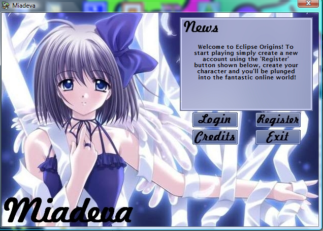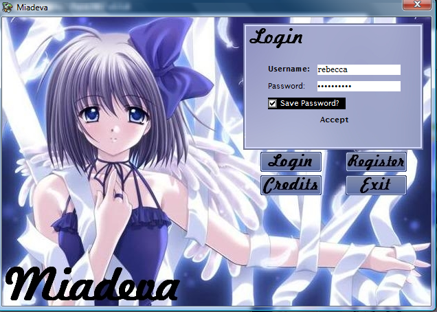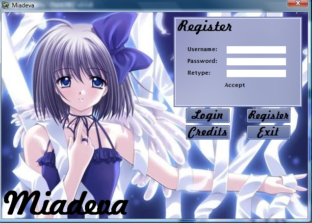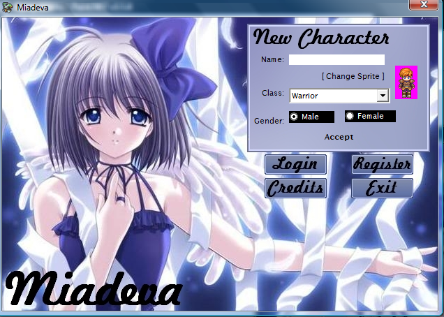 Link to comment Share on other sites More sharing options...
Robin Posted July 16, 2011 Share Posted July 16, 2011 Still pretty bad. Are you using Paint or something? You really need a cleaner font. Link to comment Share on other sites More sharing options...
beckymegan Posted July 16, 2011 Author Share Posted July 16, 2011 I'm using paint.net but my friend is coming over in a few minutes to give me her laptop with photoshop. What exactly should I change? (If you don't mind that is) Link to comment Share on other sites More sharing options...
dxxknight Posted July 16, 2011 Share Posted July 16, 2011 Listen to Robin he is a beast at GUI stuff but in my own opinion i would'nt use the girl as the background it just does'nt look good to me anyway… Link to comment Share on other sites More sharing options...
Robin Posted July 16, 2011 Share Posted July 16, 2011 Switch out the images. You don't want that shit. Use textures and effects. A running theme in the GUIs Rory and I develop is wood and parchment. Find something like that to work with.Also make sure the background is actually a background. You don't want it drawing attention away from the interface itself.Make it all lined up and properly gridded. Take a look at my various screenshots if you need ideas. Just try not to steal everything I do. ;] Link to comment Share on other sites More sharing options...
beckymegan Posted July 16, 2011 Author Share Posted July 16, 2011 One more questions, I have the texture I decided to work with (some nice blue water, should that be fine?). What font of text would you suggest? Link to comment Share on other sites More sharing options...
Robin Posted July 16, 2011 Share Posted July 16, 2011 You want a neutral texture to work with… not water.Verdana is always a safe font to use. Link to comment Share on other sites More sharing options...
beckymegan Posted July 16, 2011 Author Share Posted July 16, 2011 Would a color work? Like maybe a pale blue/green? Link to comment Share on other sites More sharing options...
Jeff Posted July 16, 2011 Share Posted July 16, 2011 Huge improvement, but sadly it's still no that great. As others have said, don't use a girl as the background picture. Then change the font or fix it up. Refer to this tutorial for inspiration: http://img233.imageshack.us/img233/6246/fontse.pngMake a theme. As robin said, you could do a wood and parchment theme, or a stone and steel theme, or something along those lines depending on what your game is like. If you're going to use a picture, make sure it's _drawn_ and not a photo. Also make sure it's pretty soft, and it's not you can use some filter effects to make it look a bit nicer. Look at how this GUI succesfully uses a background: http://i54.tinypic.com/2zq6iib.pngBest of luck!3 new replies….You can use blue or green if it matches your style, but it'll take a bit more skill to pull it off. Link to comment Share on other sites More sharing options...
Robin Posted July 16, 2011 Share Posted July 16, 2011 @beckymegan:> Would a color work? Like maybe a pale blue/green?As long as you choose the colours properly.Here's a selection of GUIs from my projects over the years. Keep in mind it's oldest to newest. Some of these date back 4 or 5 years, so you'll see an obvious progression in quality.>! 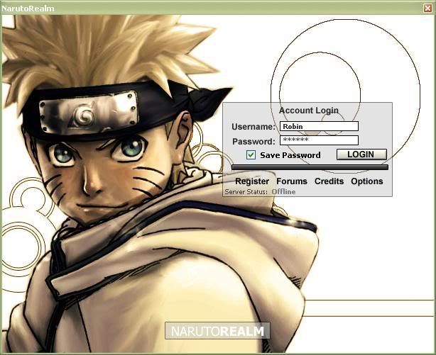>! >! >! 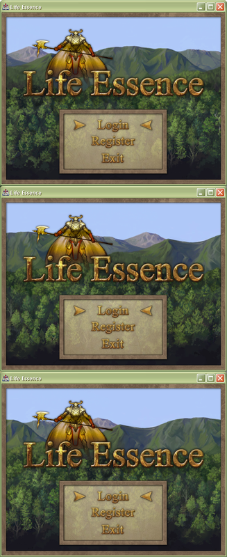>! >! 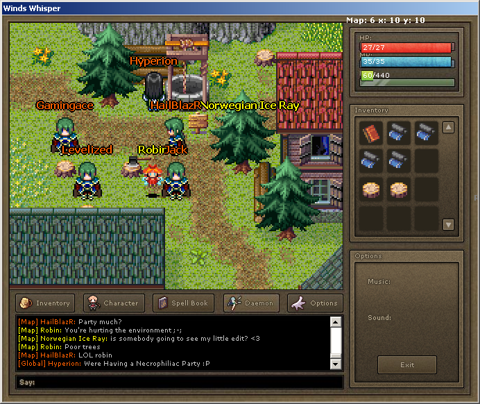>! >! >! >! >! >! >! >! >! 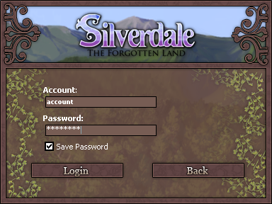>! >! >! >!  Link to comment Share on other sites More sharing options...
beckymegan Posted July 16, 2011 Author Share Posted July 16, 2011 Thanks for the pictures Robin :) Ok, I didn't go through making the credits and login page and all that because I wanted to make sure my "base" was good. Thanks so much for all your suggestions, I believe I might (slowly) be improving.EDIT: Uploaded the wrong picture :\ Fixed now. Link to comment Share on other sites More sharing options...
Robin Posted July 16, 2011 Share Posted July 16, 2011 Nooo. Look at all that empty space! You need a solid layout which looks good. That's all over the place. The texturing is way off as well. You can't just use a flat texture, you need to give it some proper edges and depth.Remove the game name. No point having that there till you have a real logo. Centralise the blank box and put the buttons evenly underneath it.The colours are also _really_ bad. The pinky brown on the right clashes horribly with the rest of it.Go look up a colour wheel on the internet and use complimentary colours. Link to comment Share on other sites More sharing options...
Jeff Posted July 16, 2011 Share Posted July 16, 2011 antialias your text, when you put a gradient on it make sure it's an overlay. Link to comment Share on other sites More sharing options...
Nayte Posted July 16, 2011 Share Posted July 16, 2011 Like Robin said, get a real game logo, or at the very least, give the name a stroke/outline or some sort of filling effect other than a simple black gradient.Keep it up though, you're improving :p Link to comment Share on other sites More sharing options...
beckymegan Posted July 16, 2011 Author Share Posted July 16, 2011 Ok, working on a logo right now but here are 3 different "versions" of my latest. I think this is a good improvement and (hopefully) you guys will like it ;)I prefer the first one btw ;)>! 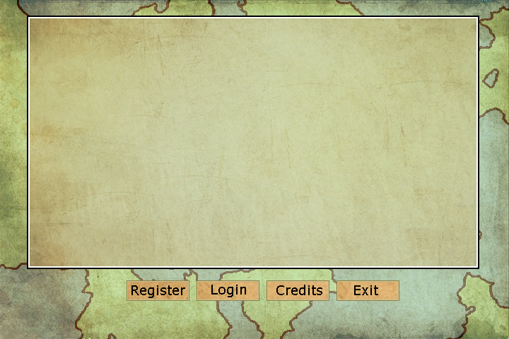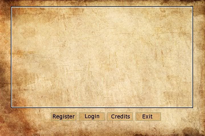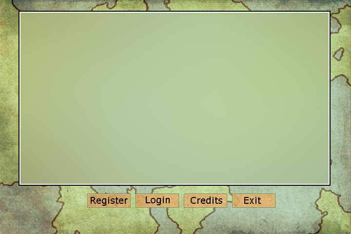 Link to comment Share on other sites More sharing options...
Robin Posted July 16, 2011 Share Posted July 16, 2011 Way too big. Clamp it down.Keep you fonts down to ~14px. Especially when working with buttons. Look at normal programs and what size they keep their fonts. Hell, look at the buttons I made for this forum.Also give them some sort of effect and make the colours match those found on the button. In this case ditch the texture you've got on there completely and give them some sort of depth. A gradient or something will do the trick. Link to comment Share on other sites More sharing options...
beckymegan Posted July 16, 2011 Author Share Posted July 16, 2011 Ok, working on that. What about the background? Did I finally get that right? :P Link to comment Share on other sites More sharing options...
Robin Posted July 16, 2011 Share Posted July 16, 2011 It's a background. Not much work needs to go in to it. I just throw in random anime stuff with parchment overlays.It does it's job. Looks okay and doesn't draw attention to itself. Oblivion did something similar. Link to comment Share on other sites More sharing options...

Recommended Posts
Create an account or sign in to comment
You need to be a member in order to leave a comment
Create an account
Sign up for a new account in our community. It's easy!
Register a new accountSign in
Already have an account? Sign in here.
Sign In Now