

Bongartist
-
Posts
266 -
Joined
-
Last visited
Never
Content Type
Profiles
Forums
Calendar
Everything posted by Bongartist
-
Wewt! I'll get there, you wouldn't believe how long it takes me to pixel the most basic work though… I hope that improves. :huh: That's for the ego food. :azn:
-
@[ð: > slym¸ link=topic=45903.msg465987#msg465987 date=1244317397] > [On Pixel Joint](http://www.pixeljoint.com/files/icons/full/iso_tiles_02.gif) > > 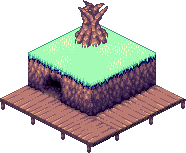 > > Suggestions? Shadow underlying the snow is to dark and distinctive. Oh, that's grass, maybe the grass is a little… Vivid? I really like the shadowing/lighting in the cave, I've tried this recently myself and know how hard it can be to get a decent result like that. Very nice work with the dock/bridge/wooden path.
-
Is 8 directional movement a function we'll be able to use in 3.0?
Bongartist replied to Bongartist's topic in Q & A
@V-Rage: > 8 directional movement is already available in 2.7, with some smart thinking > [Click Here](http://web.miragesource.com/forums/viewtopic.php?f=124&t=4430) Awesome, thanks. :D -
Which is correct for creating a 6 square by 6 square 32 x 32 building?
Bongartist replied to Bongartist's topic in Q & A
@Admiral: > **Neither.** > > Use this one: >  Thanks addy. :D -
@Minilinkki: > Looks like endless online, good work. Endless Online was my inspiration to make a 2d Isometric game, Thanks. @Nope: > 1\. the colors dont look boring at all. > looks desert like. > > _It was intended for use in my oasis/desert fortress scene._ > > 2\. small brick is fine! whats wrong with smaller bricks? > > 5\. i like it, makes it look nice. doesnt eyestrain at all. > > 7\. i dont think any colors are un-needed. > > And thats the problems i see with your post. Thanks for the input. @[ð: > slym¸ link=topic=45812.msg465985#msg465985 date=1244317289] > There are many things wrong with this image. I'll just state a few as I have to go in a few: > > 1: Colors, never use such boring colors, they will drain your work of everything. > > _Was intended as a Desert tile… But, okay._ > > 2: Never ever make a small brick (or anything else) and copy and paste it over and over again. Doing so causes your whole peice to be eyestraining and boring. > > _Bricks on my other piece are bigger._ > > 3: NEVER EVER BEVEL AND EMBOSS: The reason I capatalized this was because you never should bevel and emboss your work. (meaning one side is bright and the other is dark, over and over again). > > _What should I do for shadow?_ > > 4: Stay clear of flattening your textures: If you look at the ends of the wall, you will notice that some bricks just "bend" around to the other side. This makes your whole texture look extremely flat. > > _Yeah, I tried fixing that on my other piece of work._ > > 5: Outlines on every brick: That is a big no. This is one of the biggest reasons this wall is eye-straining. > > _Yeah, sorry. I thought the same, I was just trying to find my own unique sytle… I need to work harder on getting better first._ > > 6: Depth? You have no depth on the whole entire peice except for the fact that the right wall is darker than the other and the bevel and embossed bricks. > > _Bevel & Embossed? Explain please._ > > 7: Don't use so many colors! You have many un needed colors. Keep in mind that the more colors you have, the less it is pixel art. > > _I totally agree, I was trying to limit it, I'll work on that._ > > 8: Anti Alias: Anti alias is a very important part of pixel art. Don't just leave it out! Without Anti Alias the bricks look very crunchy. They shouldn't be. Any texture should be smoother than that. > > _AA? Explain please?_ > > 9: Your depth is off at the top: If the light source is comming from the bottom left, then there should not be a shadow on the top left of the wall. > > _Its coming from the top left, I thought that was aparent, maybe this needs tweaking._ > > 10: Missing a base: The bottom of all walls have bases. The bottom of this wall is just more bricks in the same pattern. The base should be a different pattern, make it stand out more. > > _I was thinking that, I just thought it would be a bit much with the border a lot the top._ > > I am aware this topic is locked, (Which I have no clue why). Just trying to help you out in the future, I hope my criticism helped. > > _I locked it myself, sorry I was intending to create a topic for ALL of my work, rather than just this one item. It was_ in the interests of saving space, sorry. > > I don't want to get in an arguement over some post but only say something is wrong with someone's suggestions if you have more knowledge of pixel art than they do. I was nearly posting suggestions that will greatly increase the quality of his work. Small bricks are fine, but not when on a large wall. Yes colors on there are un needed. Zoom in on it. The colors are boring. They are desaturated colors and they need to be changed. Pixel art should never try to be boring. _I agree. Thanks for the input guys, I'll take what you've said into consideration._ Criticism and tips welcomed.
-
@Minilinkki: > Looks like endless online, good work. Endless Online was my inspiration to make a 2d Isometric game, Thanks. @Nope: > 1\. the colors dont look boring at all. > looks desert like. > > _It was intended for use in my oasis/desert fortress scene._ > > 2\. small brick is fine! whats wrong with smaller bricks? > > 5\. i like it, makes it look nice. doesnt eyestrain at all. > > 7\. i dont think any colors are un-needed. > > And thats the problems i see with your post. Thanks for the input. @[ð: > slym¸ link=topic=45812.msg465985#msg465985 date=1244317289] > There are many things wrong with this image. I'll just state a few as I have to go in a few: > > 1: Colors, never use such boring colors, they will drain your work of everything. > > _Was intended as a Desert tile… But, okay._ > > 2: Never ever make a small brick (or anything else) and copy and paste it over and over again. Doing so causes your whole peice to be eyestraining and boring. > > _Bricks on my other piece are bigger._ > > 3: NEVER EVER BEVEL AND EMBOSS: The reason I capatalized this was because you never should bevel and emboss your work. (meaning one side is bright and the other is dark, over and over again). > > _What should I do for shadow?_ > > 4: Stay clear of flattening your textures: If you look at the ends of the wall, you will notice that some bricks just "bend" around to the other side. This makes your whole texture look extremely flat. > > _Yeah, I tried fixing that on my other piece of work._ > > 5: Outlines on every brick: That is a big no. This is one of the biggest reasons this wall is eye-straining. > > _Yeah, sorry. I thought the same, I was just trying to find my own unique sytle… I need to work harder on getting better first._ > > 6: Depth? You have no depth on the whole entire peice except for the fact that the right wall is darker than the other and the bevel and embossed bricks. > > _Bevel & Embossed? Explain please._ > > 7: Don't use so many colors! You have many un needed colors. Keep in mind that the more colors you have, the less it is pixel art. > > _I totally agree, I was trying to limit it, I'll work on that._ > > 8: Anti Alias: Anti alias is a very important part of pixel art. Don't just leave it out! Without Anti Alias the bricks look very crunchy. They shouldn't be. Any texture should be smoother than that. > > _AA? Explain please?_ > > 9: Your depth is off at the top: If the light source is comming from the bottom left, then there should not be a shadow on the top left of the wall. > > _Its coming from the top left, I thought that was aparent, maybe this needs tweaking._ > > 10: Missing a base: The bottom of all walls have bases. The bottom of this wall is just more bricks in the same pattern. The base should be a different pattern, make it stand out more. > > _I was thinking that, I just thought it would be a bit much with the border a lot the top._ > > I am aware this topic is locked, (Which I have no clue why). Just trying to help you out in the future, I hope my criticism helped. > > _I locked it myself, sorry I was intending to create a topic for ALL of my work, rather than just this one item. It was_ in the interests of saving space, sorry. > > I don't want to get in an arguement over some post but only say something is wrong with someone's suggestions if you have more knowledge of pixel art than they do. I was nearly posting suggestions that will greatly increase the quality of his work. Small bricks are fine, but not when on a large wall. Yes colors on there are un needed. Zoom in on it. The colors are boring. They are desaturated colors and they need to be changed. Pixel art should never try to be boring. _I agree. Thanks for the input guys, I'll take what you've said into consideration._ Could you lock and delete this topic, please? I'll use the other one.
-
I'll post examples of my work here. Criticism and tips are most welcome, no flaming though. Some wall tiles I managed to whip up, 5 minute cut and paste job but, the results are… Pleasing?  _Credit and compliments to Kusy for the touch-ups._  The grids off though…   This grid is perfect.   Some more walls I did. Gonna try Door and Windows, I'll post them later. Before this I had no experience at all working 2d Isometric tiles.
-
Which is correct for creating a 6 square by 6 square 32 x 32 building?
Bongartist replied to Bongartist's topic in Q & A
Oh well, back to the drawing board. :cry: Thanks a bundle guys. :azn: Better I know now.. -
Which is correct for creating a 6 square by 6 square 32 x 32 building?
Bongartist replied to Bongartist's topic in Q & A
Should the 32x32 tiles be laying next to each other or overlapping each other? The central lines in A are 2 pixel's wide, the central lines in B are only 1 wide. Does that help at all? Thats A, right? :huh: Argh?! I've been using B. :cry: -
Which is correct for creating a 6 square by 6 square 32 x 32 building?
Bongartist replied to Bongartist's topic in Q & A
_For ease we''ll call _this one_ A…  This one has tiles with edges that lay _next_ to each other. And _this one_ B.  This one has tiles with edges that _over-lap_ each other. But, which is correct? **Answer:** Either of these will do fine! Credit goes to AdmiralAkbar… :evil: Doh.. AdmiralRefuge. Thanks addy, this helped a lot!   This ones right too though, just not as easy to use. I greatly appreciate the fast response.. Thank you muchly. :embarrassed:_ -
Is 8 directional movement a function we'll be able to use in 3.0?
Bongartist replied to Bongartist's topic in Q & A
Just curious, there seems to be a lot of ideas for the future of Eclipse, I was wondering if this is an idea you intend to use? Please bear in mind I'm planning on using 2d Isometric tiles for my game. _Ie. The Skew feature._ What I actually mean is this a function I'll be able to use hand in hand with the Skew feature? If not… What sort of programming would teh source need to incorporate this technology? ?/10. Obviously the effect would be astounding. -
@Hippoman: > i like it! i cant find any flaws! > > you should show us some other tiles! Thanks for the compliment. I just can't seem to reproduce anything else… I think we can safely say this was a _fluke_. The tiles on this are wrong as well, it's only 2 and 1/2 32x32 long… Needs to be 3 32x32 tiles long to work properly.
-
Working on it Spike. :P And yeah, I guess Kusy, I'll bear that in mind next time. :D Just working on making a hole in that wall and gradient'ing bricks a little better. :) Thanks for tips. :D I'm not sure if the tiles will line up properly ingame though, I can't test them until 3.0 comes out as I can't use 2.7 on here. I can only hope they'll be fine. That building is based on 32x32 tiles. 4x5, should be fine, right?
-
@lollerpop: > your a natural Thanks, I appreciate that, I thought it looked terrible. :P Of course, there's room for improvement, and you wouldn't believe how long that very simple sample took to create… But, I appreciate that. :P @Kusy: I considered using copy paste but, I felt like that was cheating. :P You'd think I did as each brick is pretty much identical but, no... I did it the hard way. :P And yeah, totally my work. 100% custom. :P Ps: Sorry for ranting.
-
I haven't tried anything like this before, it's a very small sample…  What do you think? Tips and criticism welcome but, please… _Bear in mind I previously had NO experience with pixel art._ Thanks guys.
-
Yeah, I'd be happy with those for beta but, I'd consider investing more time in them before release. ;D Great work Gudor. ;D
-
The actual quality of your GUI's is fantastic, like Kusy said you need some gray-scaling meaning you need to use lighter and darker tones. (Lighter in this case.) Maybe subtle hints of color here and there. I'd also suggest inverting a few of those GUI's as the majority seem to be white backgrounded, though that might be the look your going for. For a first attempt those are great and I'd be happy to use those on MY game, though I know you don't want people to use them. Are those your Dragons?
-
Wicked! Thanks for your help!
-
We were thinking of a 45 degree angle, just plain Isometric… It'd look odd against the tiles else, we'll be using 3.0 you see, and to my knowledge 3.0 only has a 45 degree skew tool.
-
@R: > Yup, i can. What program do you use? Blender? The size is concerning me, you say you could make that smaller?
-
@R: > lolwut? XD You can add the 2d Isometric aspect to that? Oh nothing, that's just really good…
-
Holy shit?
-
@R: > I will show you some later or tomorrow. Wicked. Nice one Reap.
-
Thats… An interesting angle. Come up with some samples please?
-
@Antidote: > If you need a website or a banner to put in your siggy, I'd love to offer my services. > > I can put together the website in Joomla, giving you control over the structuring of the content, etc. I'll just set up the style and how it generally looks, menus, graphics, etc. > > As for a siggy, if you want it, I'll need colors, potential pictures to put in it, and whatevan else you'd want me to add. > > And…it's free. I'm currently just working to get experience instead of money. We don't really have any material at the moment, we haven't started development. (Waiting for 3.0) and I got someone working on a site, thanks. Really appreciate the offer though. @R: > Ok ^^ I could help you with Iso buildings :P You could?