

Stava
-
Posts
32 -
Joined
-
Last visited
Never
Content Type
Profiles
Forums
Calendar
Everything posted by Stava
-
>  > > Do you have a Deviant Art or Pixel Joint account? I have both !  [http://www.pixeljoint.com/pixels/profile.asp#iv](http://www.pixeljoint.com/pixels/profile.asp#iv)
-
Thanks all ! > Stava and I came from the same small community, he helped out people and inspired them to be better pixel artists and gave criticism when needed,I'm pretty sure he's used to people asking him to join in on things pst* he is a freelance artist. But yeah, I showed my half-decent GUI's about three months ago I got bombarded with requests can't imagine how Stava's inbox is holding up at the moment (lol). > > One of his best works, imo; Hello Nerva  Yeah my inbox is getting kinda bombarded.. THAT GAME WILL BE FINISHED ONE DAY ! I spoke with the programmer and we are doing a different, small, project now, so when we finish that we'll probably get back to this  **NOTE: not free to use !** Some more pics:  a idea mockup: 
-
My pixel art   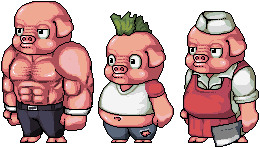 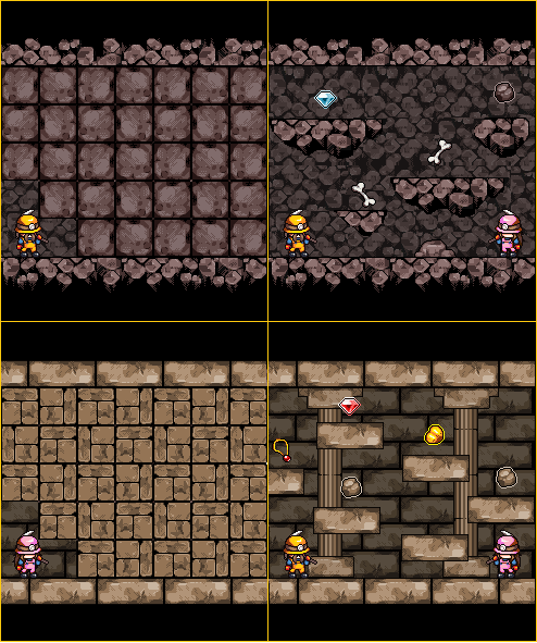   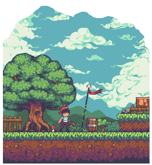   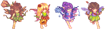 
-
If I was you I'd rather redo the tiles to match the sprite, sprite looks great the way it is.. But you could try both if you have so much time lol
-
Hey I found some time and decided to help you out with a edit, and made a small tutorial too, hope you understand and hope it helps you out. Here it is:  In the 1st box I was just showing that the dark brown trunk somewhat matches the sprite, and I put my edit in the 1st box so you can compare them In the 2nd box I showed you palette mismatching in contrast between colors, and my fix on the same palette. I think 3rd box doesn't need explanation xD
-
Hello I have a few critiques.  1\. You should use a different color for the top of tree, probably should be darker than the grass. So it stands out in front of the grass. And the dark trunk compared to the top, doesn't go together at all 2\. Why are the cave walls so straight, it's alike bricks I think you should make it different, more like rocks.. 3\. Same as with 2nd 4\. Isn't that a little too pale? Maybe contrast it a little, not too much though so it doesn't stand out more than player sprite. That's about it, I like the game looks, but with those few fixes done I think it would look way better, hope I helped ;)
-
Hello! I'm new to this forum, this is my 1st post. Decided to join it since I was invited to work with some team and the person who invited me linked me this forum to see some projects. This seems like a really interesting forum I'd like to stay around, I am really interested in art and 2D graphics. Well anyway, I've designed some isometric 2D tiles and a tree, it's still kinda WIP but here's what I have so far:  I used enlarged pencil tool, done in Paint. Thinking of editing the colors :P C&C