

Murdoc
-
Posts
1795 -
Joined
-
Last visited
Never
Content Type
Profiles
Forums
Calendar
Everything posted by Murdoc
-
*bump* If you're an experienced mapper and wanna be part of the creation of [Gates of Endar](http://www.eclipseorigins.com/community/index.php?/topic/129252-gates-of-endar-wip/) shoot me a pm.
-
From wikipedia: "Image filters (such as blurring or alpha-blending) or tools with automatic anti-aliasing are considered not valid tools for pixel art, as such tools calculate new pixel values automatically, contrasting with the precise manual arrangement of pixels associated with pixel art."
-
I'll try to make this introduction short and sweet. Our company KAOinteractive is steadily growing but we are need of a few additional members to assist in development of our games. Two previews of games already in development can be seen [here](http://kaointeractive.com/forum/misc.php?page=home) (Adventures of Squirrely, and Gates of Endar). And, the WIP for Gates of Endar can be seen [here](http://www.eclipseorigins.com/community/index.php?/topic/129252-gates-of-endar-wip/). We have other projects already in the works and ideas are in no short supply. Now, more to the point. Although we already have a solid team of 5 members (Kibbelz, Major Tom, Dax, Azkanan and I) we're looking for the following: Pixel Artist (1) Mappers (1-2) Certain criteria must be met in order to qualify: If you are a pixel artist you must be able to at least match the following quality of work: 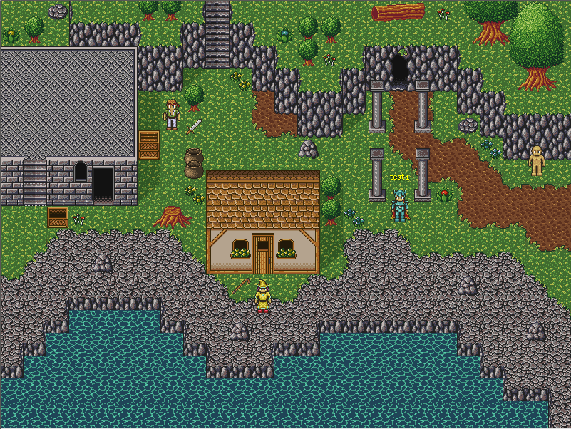  And If applying for a mapper position, you must be able to match quality similar to this:  Any interested candidates should pm me with examples of your work. And, if you have questions about our company and what our long-term goals are, just shoot me a pm and I'll give you the details. Murdoc
-
> I honeslty don't care what you think it looks like, obviously if it looks similar it means I did a good job anti-aliasing it. No gradient tool you use for a circular gradient has a + pattern. And I honestly don't care if you think it's pixel art. It's not.
-
> I did to the gradients pixel by pixel. I created a sketch of the gradients with the tool to get the pallet colors I needed then pixled it. Still not "pixel" art. I downloaded the image and scaled it to make sure. They're too anti-aliased for me to believe you used a 1x1 pencil. Looks like you used the gradient tool and a brush to make the highlight.
-
Unless you do the gradients pixel by pixel, it's not pixel art. "Art" maybe, but not "pixel art" ;)
-
Was into rpgmaker 98 when it first came out, and having played 2d mmo's like Nexus I wondered If i could make something similiar. Did a search and found xtremeworlds, which eventually led me to Eclipse.
-
Cool :)
-
The game looks great. Hopefully you find someone to help. I thought this looked cool: 
-
Primal Hero - Online Browser-based Monster Fighter
Murdoc replied to magezhilo's topic in Non-Eclipse projects
This game has amazing potential. Love the character customization. -
This is sick! The last screenie reminds me of claymation. Pure awesome sauce.
-
I like it. One brighter shade would make everything look better though. And those black outlines contrast too much with the piece.
-
> I really like the "solid"-ness to these graphics. Their boldness reminds of me of a blend of both Pokemon (mostly the palettes) and someone's off-hand paint project. They add-well to the subtle pre-school ambiance of the game. A bit uncanny. > > (Have I already said that in this thread? "Uncanny"?) > > > > _edit: turns out that I have…_ Your choice of words are uncanny in that they are inexplicably mysterious.. @_@ On-topic: Keep it up Kreator. This game makes me laugh, and I want to play it again!
-
Loving the main concept, and your graphics look great!
-
https://www.youtube.com/watch?v=QexOuH8GS-Y
-
That fps! :o
-
Download some better fonts, use Adobe Photoshop's blending options to make the text fancy (play around with them), and save the image as .png (lossless quality) not .jpg. That's the best advice I can give.
-
4th map needs more diversity, like rocks different trees.. looks too mechanical atm
-
This peaks my interest. Looking forward to more updates.
-
Please credit the folks at [http://charas-project.net](http://charas-project.net/) .. some of these are barely edited or not at all. I think they deserve a mention at least. Not to mention enterbrain for creating most of the sprites in the editor (rpgmaker 1995).
-
I posted this awhile back.. worth a look [http://www.eclipseorigins.com/community/index.php?/topic/134295-taboos-of-orpg-creation/?hl=taboos](http://www.eclipseorigins.com/community/index.php?/topic/134295-taboos-of-orpg-creation/?hl=taboos)
-
Web/Graphics Development, Web Hosting from $0.99
Murdoc replied to harrison858's topic in Talent Center
> I see, but then you should of waited to post this until you had examples. First impressions are everything, friend. :) If it turns out he's really good and someone wants to pay him, I doubt anyone will say "yea, but you didnt show your portfolio soon enough!" :P -
Web/Graphics Development, Web Hosting from $0.99
Murdoc replied to harrison858's topic in Talent Center
> You should show examples of your work, especially if you want to be paid. > I'll post examples of work when I have a chance. -
I'll give my critique from a designer standpoint. There's not enough consistency and things that should stand out don't. The logo for example: The word "games" stands out more than the actual title. You want people's attention to be on the main part of the logo, not "games", "studio" or whatever other ending. The transparency in the green text "Generation Nation" causes it to look cheap and cluttered because of the shadow behind it. I would get rid of the transparency, and possibly move the shadow closer so it's not as cluttered. The white double border around the logo also looks bad. It is too bright for the dark colors (making it stand out too much), there's no space between the box and the nav bar, and well.. it just doesn't look nice. In my opinion, it would look better if the logo was not boxed in at all but that's me. In the same respect, the border around the topics is also too contrasting. As for the navigation bar. Light grey on light green (when scrolling over the nav links) is fugly. The navigation text also doesnt stand out enough when compared to other fonts on the site. You don't want this. Make the text bold (or bigger) and make them at least as bright as your main page headers. (I realize this would mean changing the nav bar bg color, but it's something to consider) As far as the colors. The grey that you've chosen really clashes with the green colors. If you want to use grey, try at least giving the grey a hue that blends more with the greens you have. A second color that isn't neutral would also make the site nicer to look at. (Instead of being mostly green) As long as it's not in just one place. Overall I think it's an alright attempt at a site, as far as layout goes. But, it fails to be interesting to look at and like a cheap site from the early 90's. I'm not implying it has to be fancy by any means. I'll show you two professional game company websites that are simple yet nice to look at: 1\. Perfectworld [http://www.perfectworld.com/](http://www.perfectworld.com/) - The logo is simple but it stands out. There are borders but they match the color scheme. And the use of gradients in some spots really gives the site character. The navigation bar can't be missed, flows with the rest of the page and has nice rollovers. 2\. Nexon [http://nexon.net/](http://nexon.net/) - Again, simple logo but it stands out well. There is next to no borders and yet the page flows nicely, due to a well chosen color scheme (just plain ole blue and off-white but it's nice to look at) and little touches like the shadow under the top navigation area and footer which give the sections depth. These are just a couple examples, but there are plenty more like these that show how you can stick to a simple layout (as you have) and still have a great looking site. My suggestion is to look at as many professional game sites as you can, see what makes them good, and take ideas from them.
-
The new tree looks great! Although as Andiii mentioned the cliffs pop out too much in comparison with the sprite/tree. I'd also remove the outline at the bottom of the cliff so it flows into the grass more. Nice work! :)